FinX: A FinTech Conference Design - Branding & Visual Identity
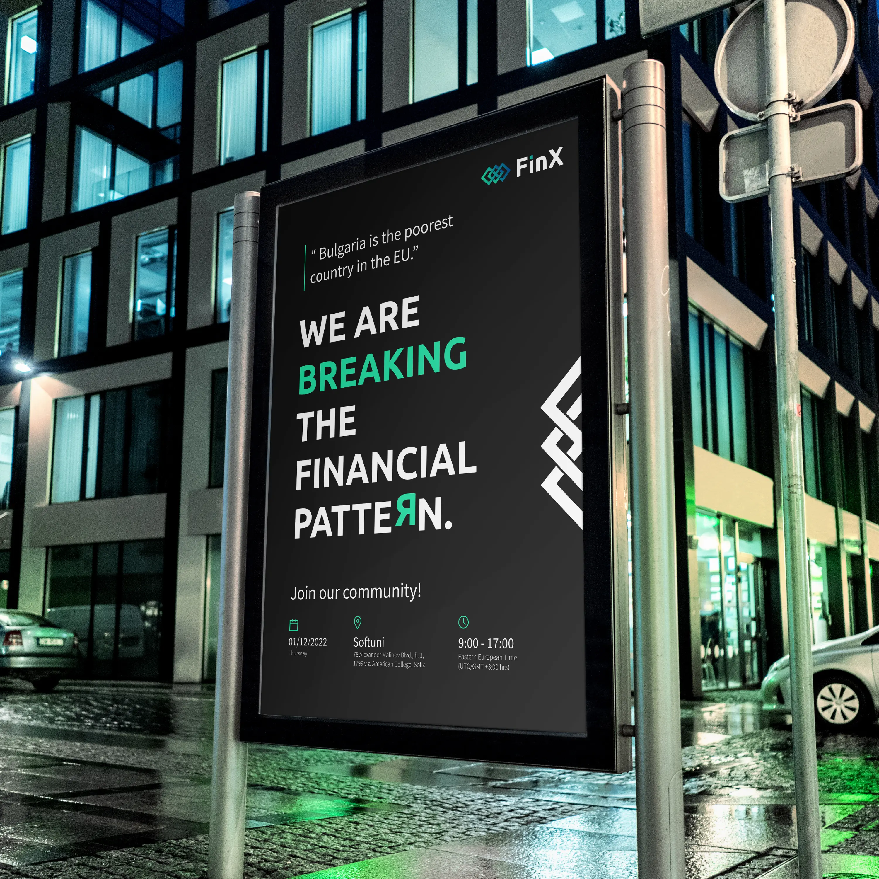
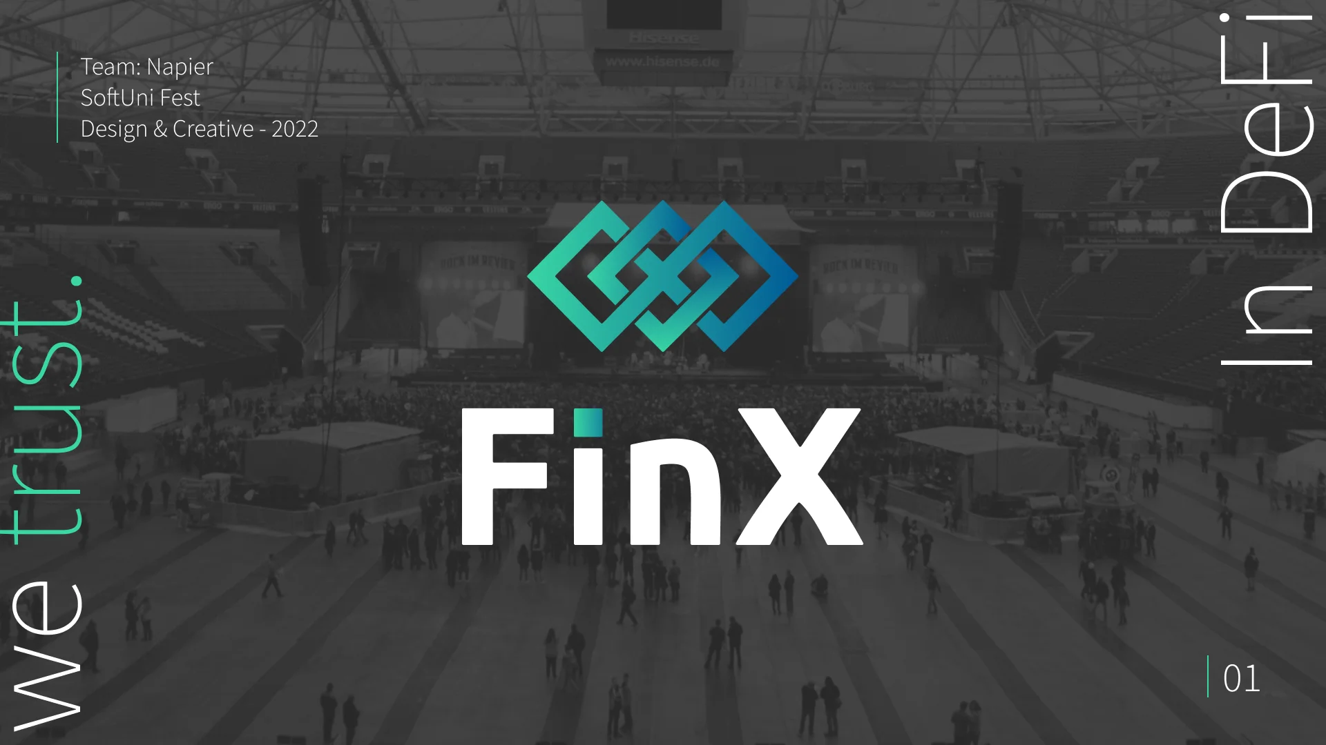
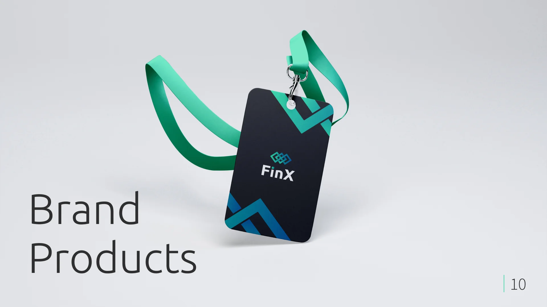
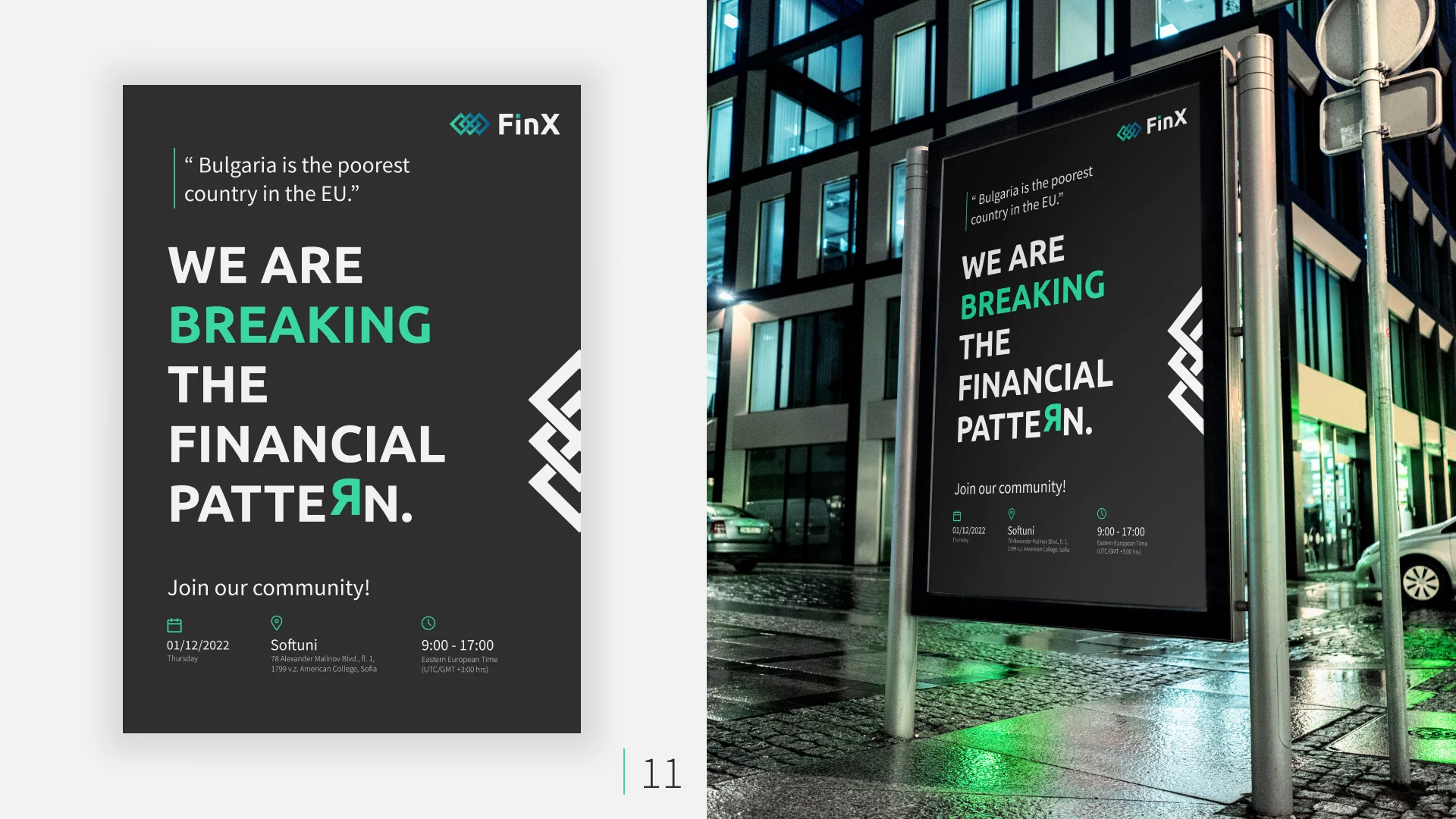
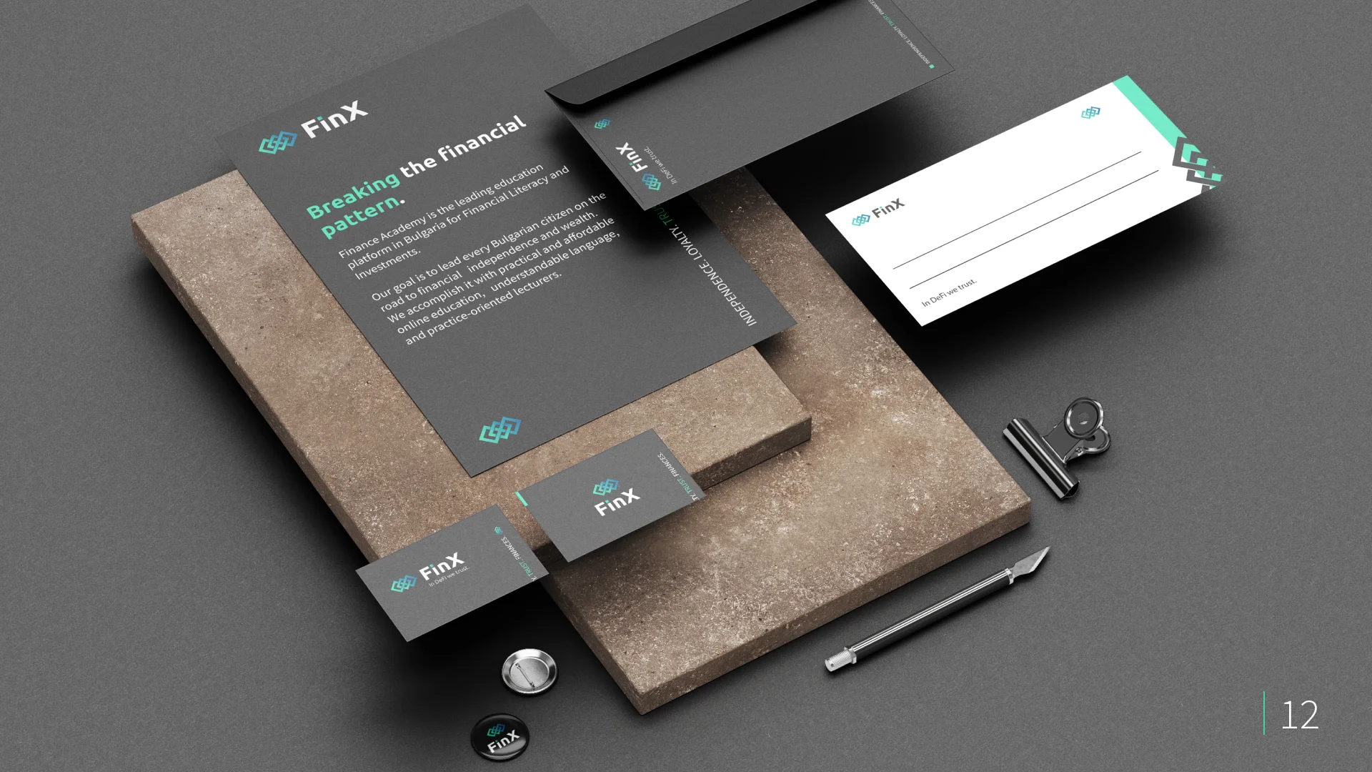
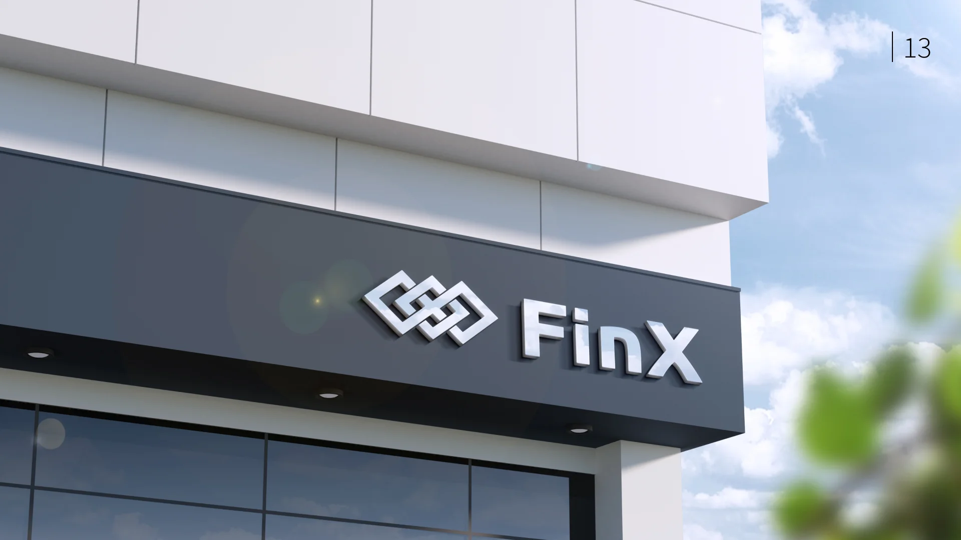
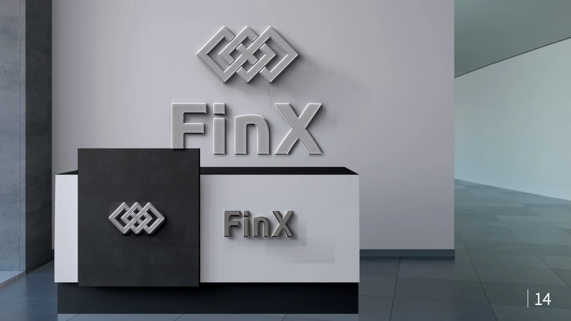
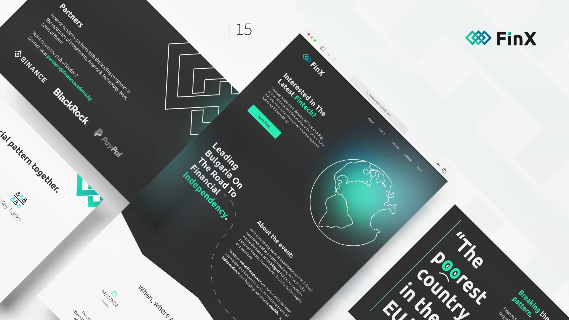
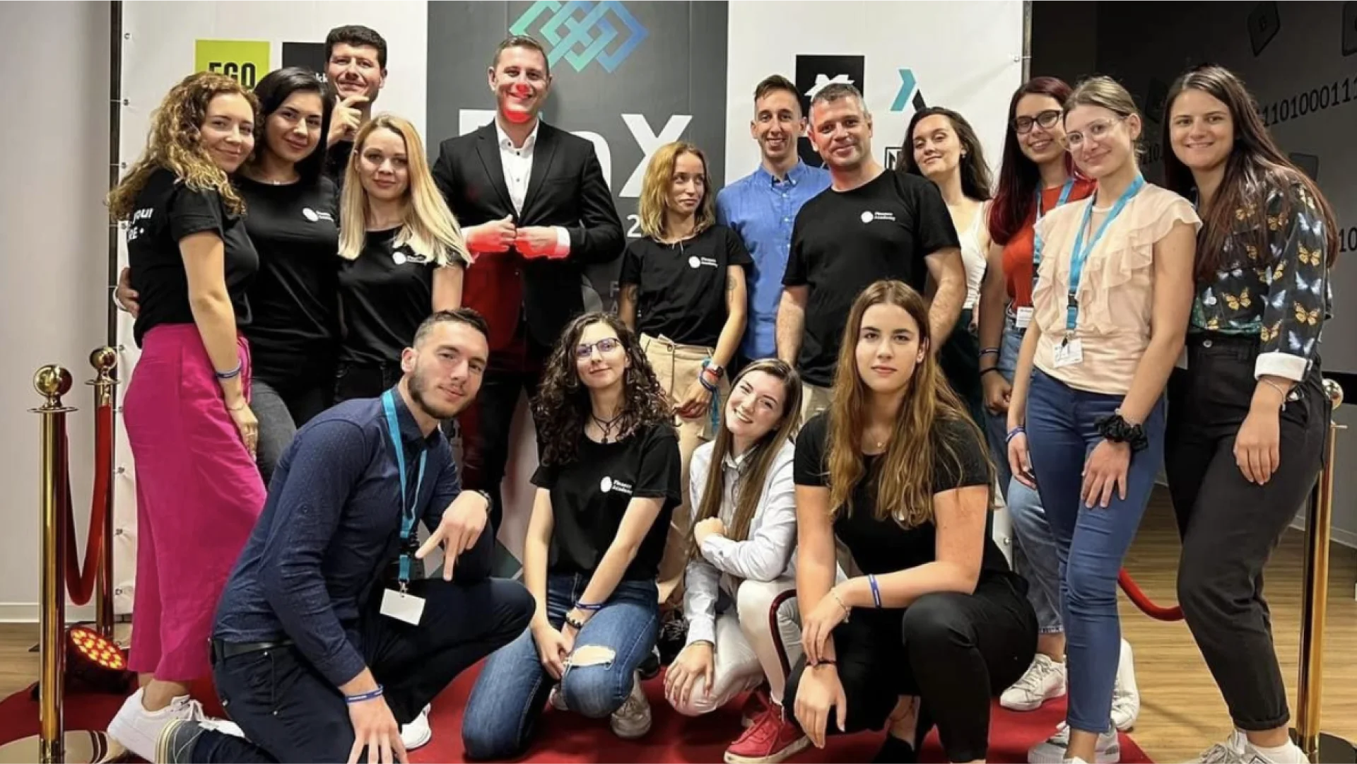
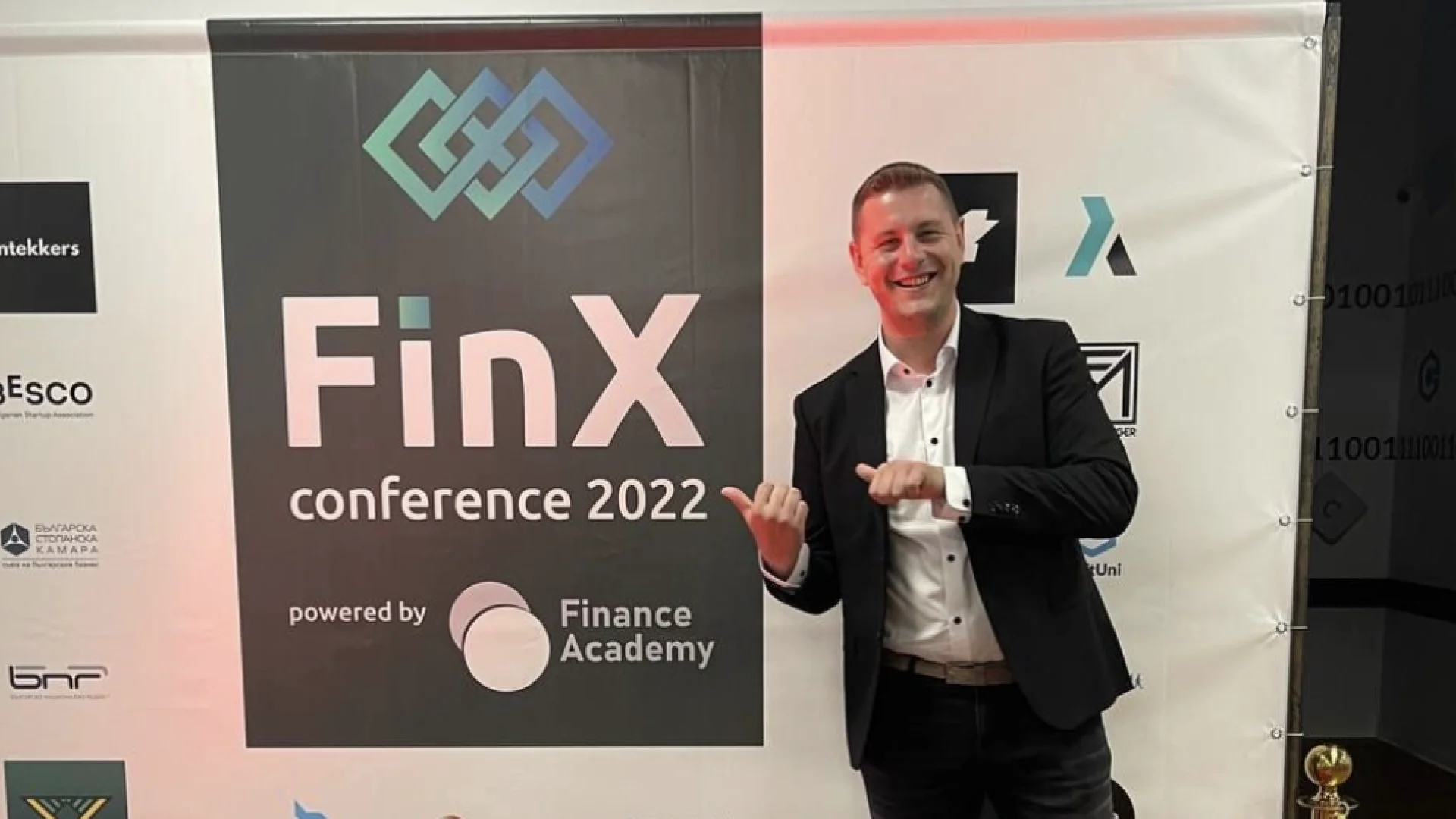
This project won first place on a National Design Competition in 2022 conducted by SoftUni, Bulgaria. The task was to create branding and visual identity for FinTech conference that includes the branding, website landing page and a presentation design. The produced designs are used by Finance Academy (sponsors of the event) for annual FinTech conferences with hundreds of attendees, social media posts and presentations.
Project Details
Industry: FinTech
Competition duration: 48 hours
Deliverables: Branding & Visual Identity, conference presentation and a website landing page.
Team: Hristina Varbanova, Iliyana Pirinska
My role
-
Branding
-
Visual Identity
-
Presentation
Design Process
Our design process for the FinTech conference branding and visual identity involved
extensive
research, collaboration, and brainstorming. We allocated over half of the given time to
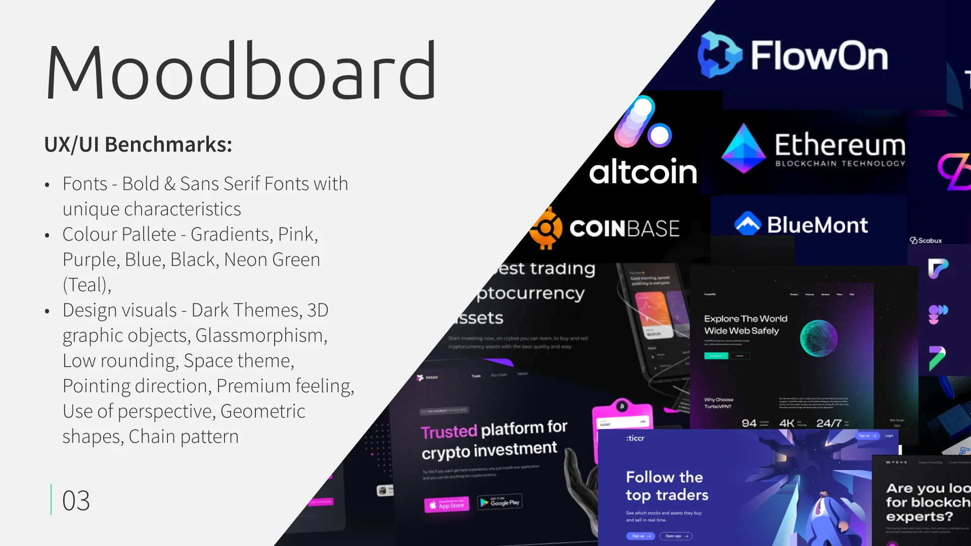
researching industry trends, design benchmarks, and UX journeys to ensure that our
design was
informed by the latest practices and trends. We divided the wor between the team, with
me
focusing on the branding and visual identity, while my colleague took care of the
website landing
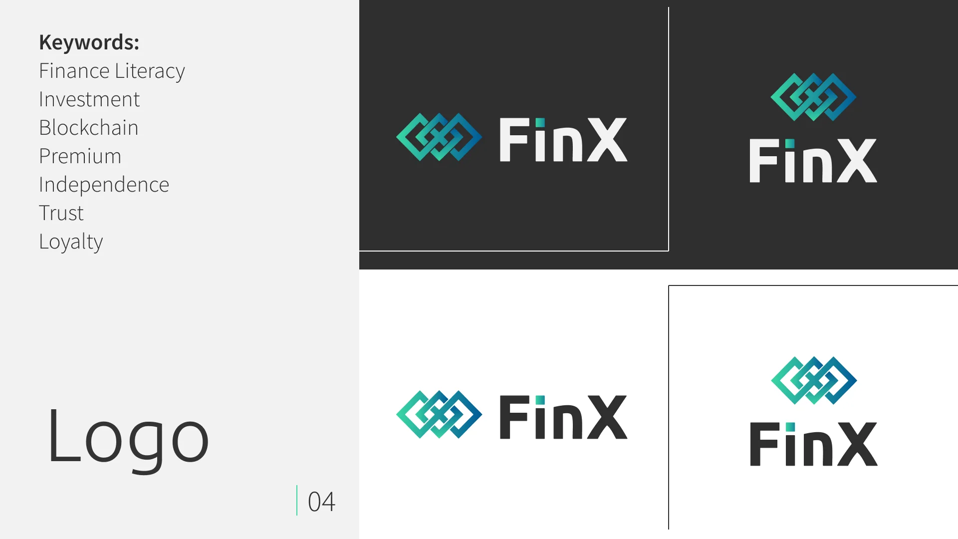
page. We worked together to brainstorm the initial colors, logo, and motto, ensuring
that the
final product aligned with the vision of the client.
Given that we were working remotely from our homes, we recognized the
importance of efficient communication and collaboration to ensure the success of the
project. To facilitate this, we implemented regular check-ins every hour and a half to
share ideas, present progress, and provide feedback on each other's work. This approach
allowed us to iterate quickly and build the essential branding elements at a rapid pace.
Furthermore, we practiced presenting our project and offered constructive feedback to
one another in preparation for the final presentation to the jury. Through our
commitment to regular communication and feedback, we were able to create a cohesive and
compelling visual identity for the fintech conference.
Challenges
01 / Short timeframe: We had a limited amount of time to complete the project, which made it challenging to deliver high-quality work within the given time constraints. Despite the tight deadline, we worked efficiently and collaboratively to meet the client's needs.
02 / No prior experience in branding and visual identity: As a UX/UI designer, I had limited experience in creating branding and visual identity, which made it challenging to deliver a product that met the client's expectations. However, I used my design skills and conducted extensive research to ensure that our branding and visual identity was unique, effective, and aligned with the client's vision.
03 / No knowledge of fintech industry design: None of us had prior knowledge of designing for the FinTech industry, which initially made it challenging to create designs that effectively communicated the conference's message. However, we dedicated ourselves to learning about the industry and its design trends, which helped us create a visual identity that was relevant and appealing to the target audience.
Key lessons
Always Research First
Discovering insights before designing delights
Collaboration is key
Design is a team sport - winning together, not alone
Stay humble
Design with empathy, listen with humility
Quality over quantity
Less is more - designing for purpose, not abundance
Other Creative Works
Please feel free to explore other projects I have worked on
