Akindo: A Creative Student Platform - A Comprehensive User-centred Case Study
Akindo is a dynamic mobile marketplace app that empowers student creativity. With Akindo, students can showcase and sell their exceptional work across various fields, including graphic design, illustration, music, 3D models, and motion design, among others. This innovative platform also provides a dedicated section where industry professionals and university lecturers can provide invaluable feedback on works-in-progress, ensuring students can hone their craft and reach new heights of excellence.
Project Details
Industry: m-Commerce
Project duration: 4 months
Deliverables: UX Research, Questionnaires, Interviews, Usability Testing,
Analysis, Wireframing, Prototyping
Team: Iliyana Pirinska, Catherine Campbell, Junko Smith, Cristian Zennaro,
Karolina Lencina
My role
-
Lead UX/UI Designer
-
UX/UI Researcher
Introduction
The present project was undertaken in collaboration with four other Web
Design & Development students. As part of our 'User-centred
Organisational Systems' module, we meticulously conducted user-centred
research methods and conceptualized a platform based on our analysis.
The project will present both my soft and hard skills in terms of
teamwork, collaboration, organisation, design, research and testing.
Data-gathering methods
Our approach involved a rigorous application of three data-gathering
methods - Questionnaires, Interviews, and Unmoderated Usability
testing . The questionnaire was instrumental in providing us
with
critical insights into the anticipated platform features, as well as how
other stakeholders, including University staff, IT staff, Alumni, and
buyers, might potentially interact with the platform. By utilizing the
questionnaire findings, we could enhance our low-fidelity sketches and
incorporate new ideas into our features.
Through the use of interviews,
we were able to obtain in-depth information on users' experiences and
expectations regarding the platform. Finally, we implemented
high-fidelity wireframes and conducted usability testing to ascertain
users' ability to navigate easily throughout the app.Collectively,
these three methods helped us establish, improve, and upgrade our
project, ultimately culminating in an evidenced user-centred
organizational system.
The team & my role
I was part of a team of five people - Junko Smith, Cristian Zennaro, Karolina Lencina, Catherine Campbell, and me. As for the roles, we decided that each would practice the methods to gain better insight and learn more about data gathering individually. However, there were tasks that each of us felt more comfortable doing and took responsibility for delivering them on time. For example, as I was most experienced in working with Figma, I took care of the file organisation, used the low-fidelity wireframes the team designed and turned them into high-fidelity prototype ones and structured the Usability testing.
Quesionnaire
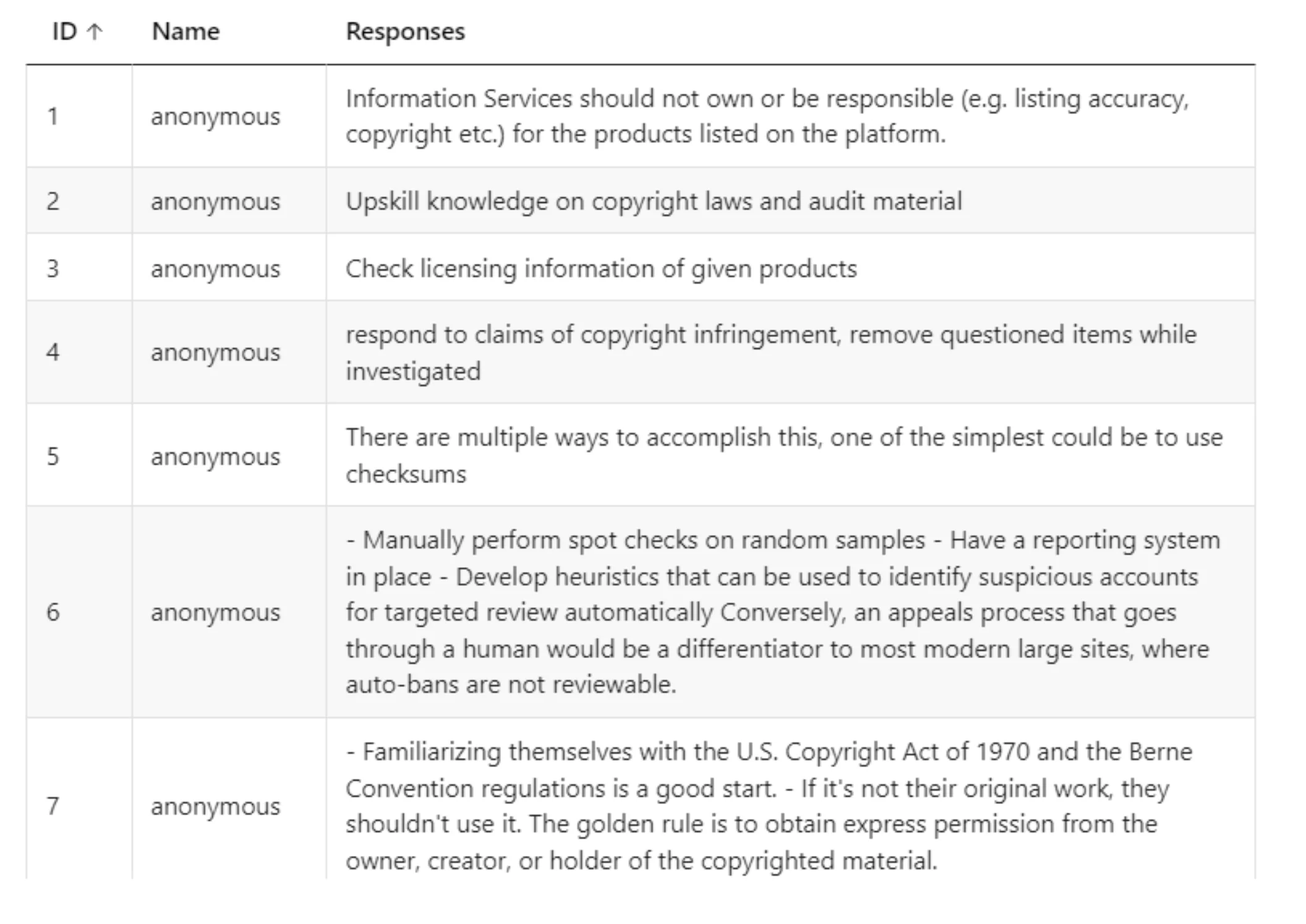
A questionnaire was developed to understand the online marketplace experiences and preferences of various stakeholders including IT staff, who are responsible for platform maintenance. The task involved crafting questions to gauge their strategies for platform maintenance and ensuring user privacy and confidentiality. The initial questionnaire was more suited for developers, leading to a revised version that focused on typical IT responsibilities. This revision was aided by team collaboration, proofreading, and pilot testing with external feedback. Despite limited responses from university IT staff, reaching out to external companies yielded valuable insights. Key findings included preferences for communication methods, response times, prioritization of tasks such as account investigations and technical support, and suggestions for a reporting portal and strict terms & conditions. The process highlighted the importance of targeted audience research to avoid unnecessary revisions and the value of piloting and team feedback in refining the questionnaire. It also suggested that a more focused approach on fewer stakeholder types might be more effective in future research endeavors.
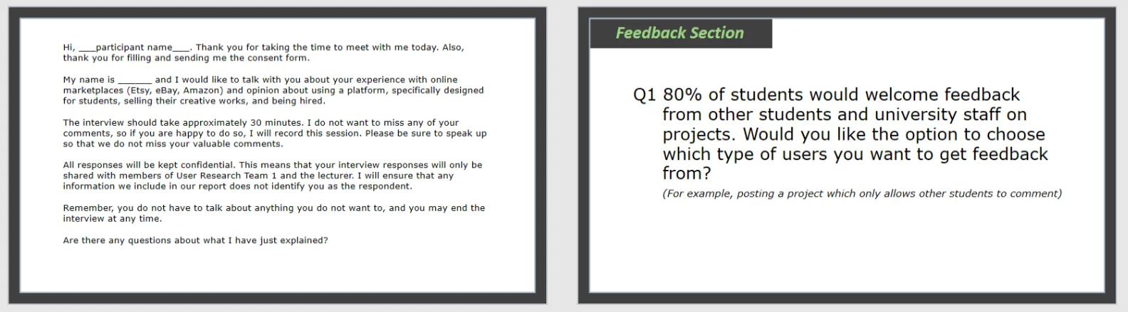
Interview
Learned from Interview Research Method:
The interview process provided valuable lessons in communication with potential users, structuring interviews, and analyzing results. Key takeaways included:
- Thematizing: Understanding the importance of thematizing helped in identifying the topic, objectives, and purpose of the interview.
- Question Refinement: Collaboratively reviewing the interview schedule was crucial in critically reflecting on and omitting irrelevant questions.
- Participant Sampling Challenges: Finding willing participants was challenging. Initial efforts of randomly emailing students were not successful, leading to a strategy of personally inviting known students. This highlighted the need to allocate sufficient time for participant sampling and communication.
- Interview Preparation and Ethics: Lessons from lectures and practical classes on ethical considerations, communication manner, analysis, and documentation were instrumental. These included the importance of active listening, avoiding assumptions, controlling the interview, conducting technical checks, ensuring a distraction-free environment, and secure data storage.
- Creating a Comfortable Interview Environment: Learning to maintain an interviewer's attitude that makes participants feel comfortable was crucial.
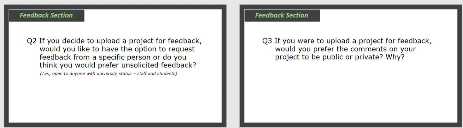
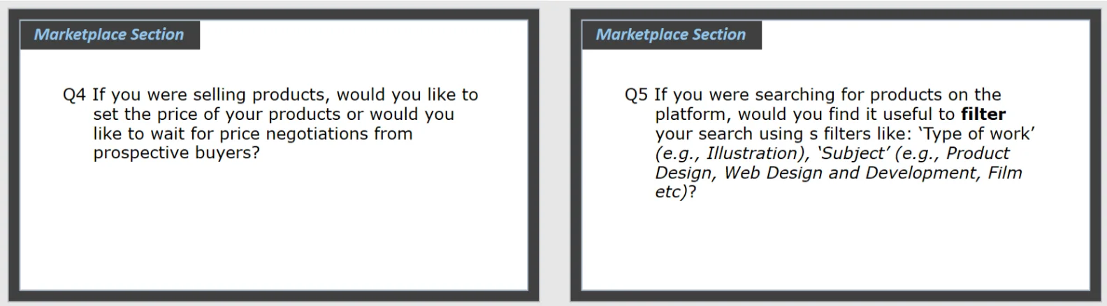
Results from Interview Research Method:
The interviews with students provided critical insights for refining the platform:
- User Preferences: Users preferred having options in receiving/requesting feedback, choosing between private/public profiles, and selecting filter types.
- Interface Adjustments: Insights revealed that the positions of "favourites" and "notifications" buttons were not optimal, leading to their relocation.
- Service in Exchange for Payment: The idea of accepting service instead of payment was favored, especially among first-year students looking to build their portfolios.
- Delivery Location for Printed Works: It was concluded that the best location for delivering printed works for Napier students would be the JKCC lab, as it's open 24/7.
These insights were instrumental in refining the mid-fidelity prototypes and aligning the platform more closely with user expectations.
Usability Testing
Initially, the team planned direct observation for prototype testing, but later opted for unmoderated usability testing using Maze due to remote team members. Simultaneously, moderated testing was conducted during practical classes. The main tasks involved turning mid-fidelity wireframes into high-fidelity ones and structuring testing in Maze for various user flows like purchasing a product and editing profile information. The testing aimed to evaluate the user experience and interface user-friendliness. Challenges encountered included missing connections and components, small font sizes, and incorrect labels. Despite limitations in Maze's free plan, the team managed to pilot test, refine, and publish the test, inviting students to participate. Moderated tests recorded screen and audio, with participants asked to verbalize their thoughts, facilitating a deeper understanding of their behavior and feedback.
The platform we used generated a report that
included detailed metrics like heatmaps and
usability breakdowns, which helped us make an in-depth analysis
even for the unmoderated testing. The testing usability score
is
76%, measuring the ease of the test (19 participants).
The
testing has seven tasks, consisting of 3-7 screens. The
average
miss-click rate is 22%.
There were two tasks in which the participants experienced
difficulties. The other five tasks have minimal miss-clicks and
almost no bouncing.
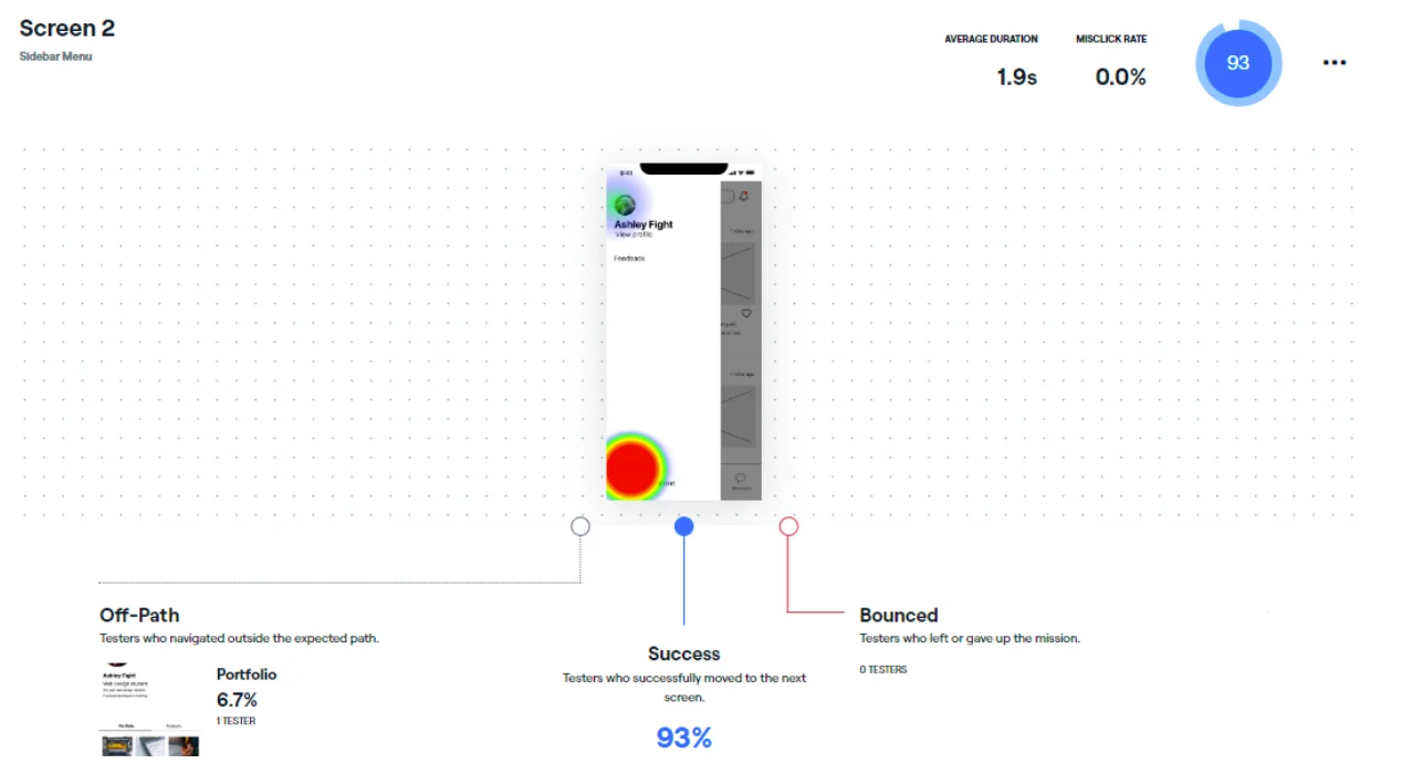
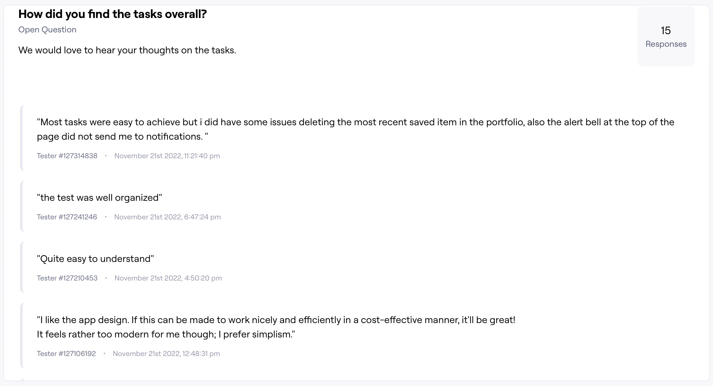
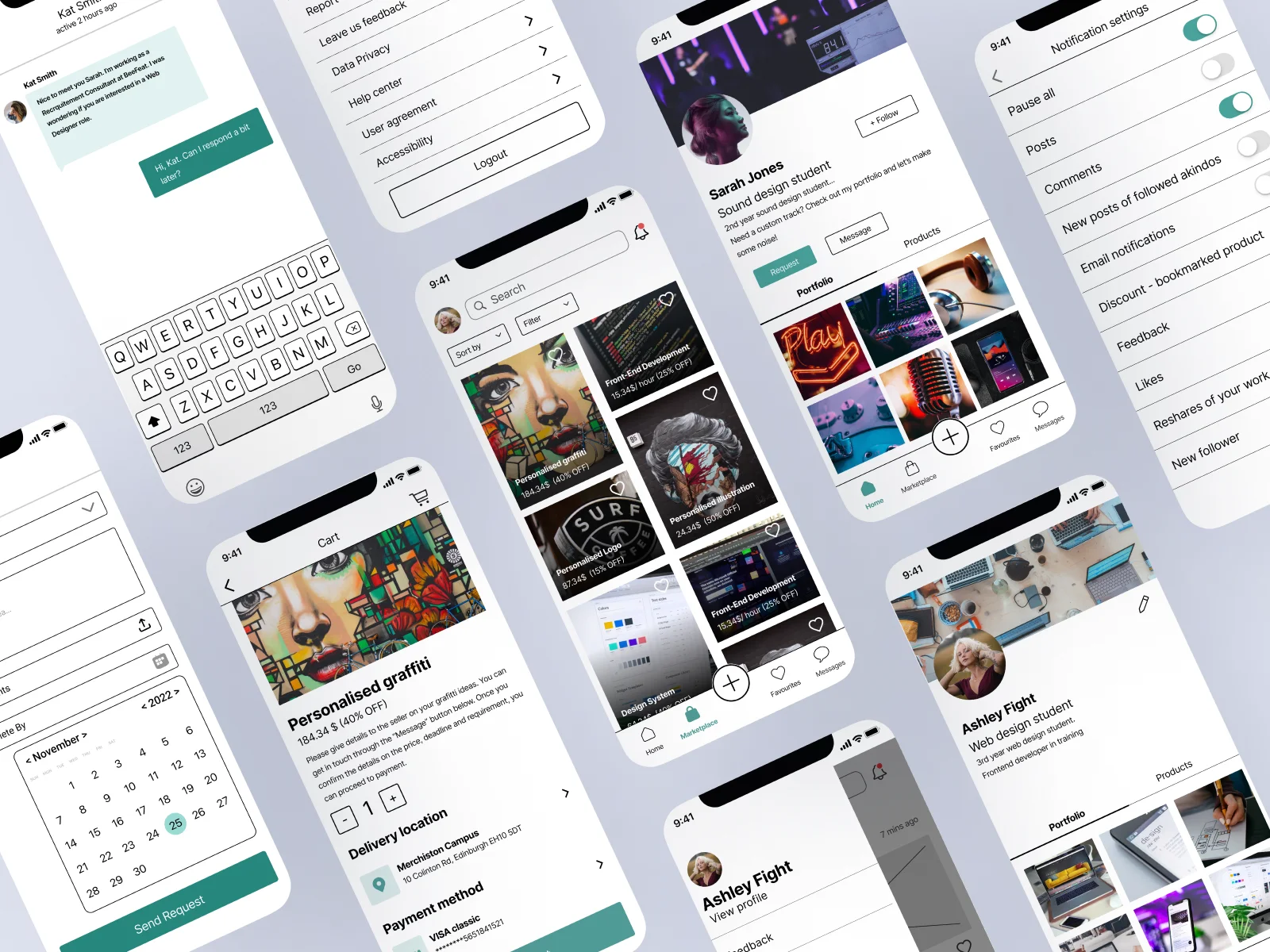
The participant had issues with the task asking the users to
find switch off their email notifications. The heatmap showed us
that some of them searched for it on the user profile (Figure
1).Other respondents reported that they knew where the settings
button was because of the previous tasks.
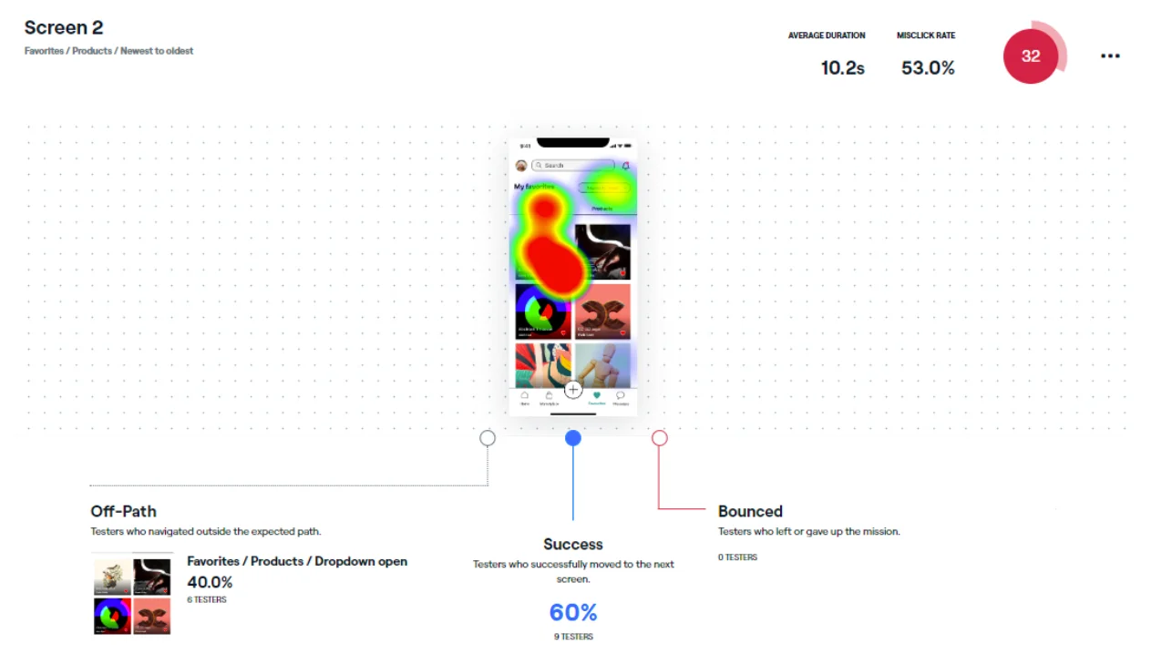
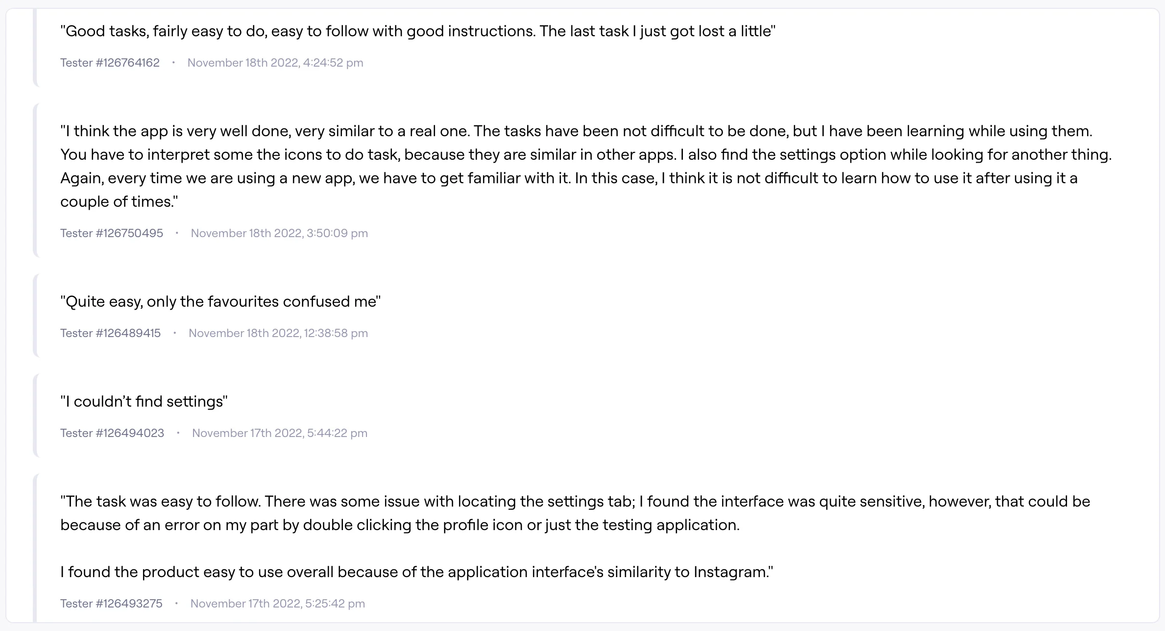
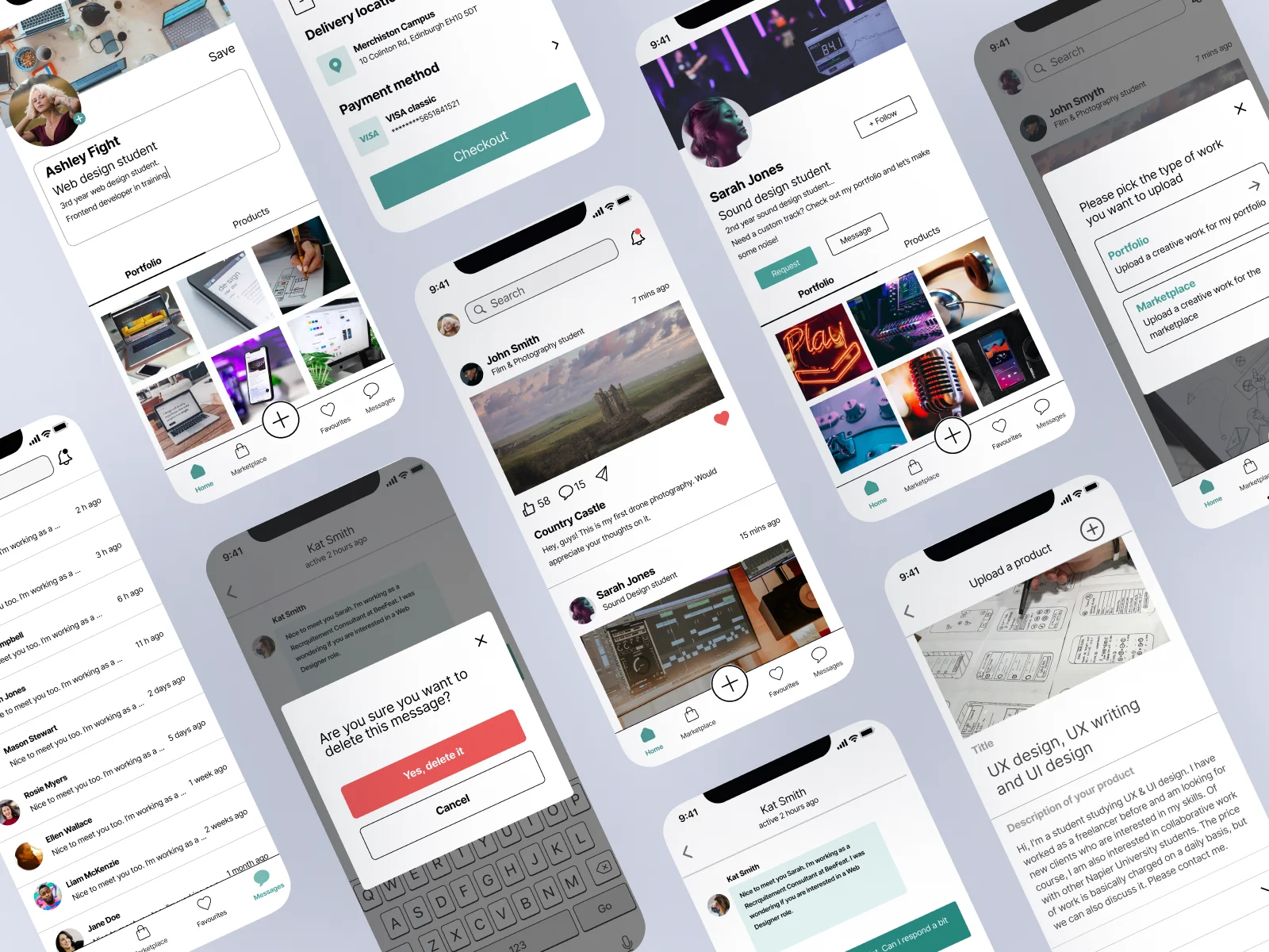
The most challenging task required removing the oldest portfolio
item they had saved. When asked, the participants said that they
found the task description confusing and the sorting component
small (Figure 2).
Overall, they commented that they liked the interface, and the
app was easy to navigate.
Based on the testing analysis, we decided that
the settings should be in the user profile section. The research
showed us that we need to increase the font size and the
dimensions of the buttons. We realised the description of the
"favourites section" task was confusing. I believe the
issue
occurred as this task did not go
through piloting.
While conducting this research method, I enhanced my skill of
analysing user behaviour and drawing insights that help
design
user-centred interfaces.I boosted my critical reflection
skills
as I found gaps in the design stage that resulted in issues
in
some tasks.
The unmoderated (remote) testing saved us time and effort and
enabled us to test different types of stakeholders. However,
we
could not discuss the difficulties they experienced and had
to
assume things.
On the contrary, the moderated testing enabled us to ask
questions after the participant completed all tasks.
Moreover,
we could record their mouse movement and voice, which helped us
analyse their behaviour. The disadvantage is that the moderated
one required more time to find participants and schedule the
sessions.
As for the research stages, I noticed that structuring the
usability testing is time-consuming and realised the importance
of piloting and proofreading.
View Analytics Report
Do Usability Testing
Logo
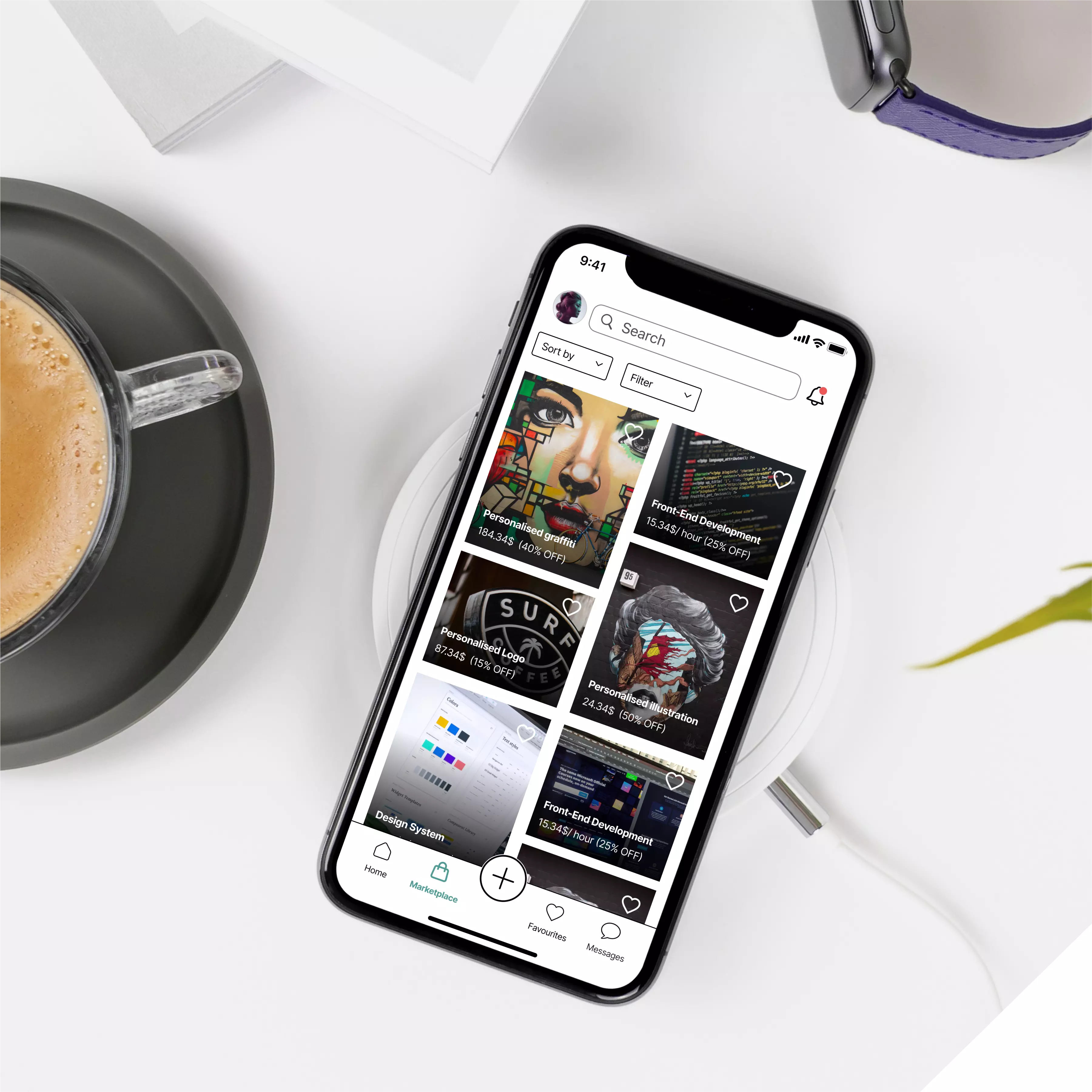
The app logo was created by Cristian. The logo forms the letter “A” of Akindo while recalling Japan for the origin of its name. It has white, red, and black colours, which are the colours of the Japanese flag as well as Napier logo, representing the relation of the app and the institution. Each member of the team really liked it, and we did not want anything to be changed.
![]()
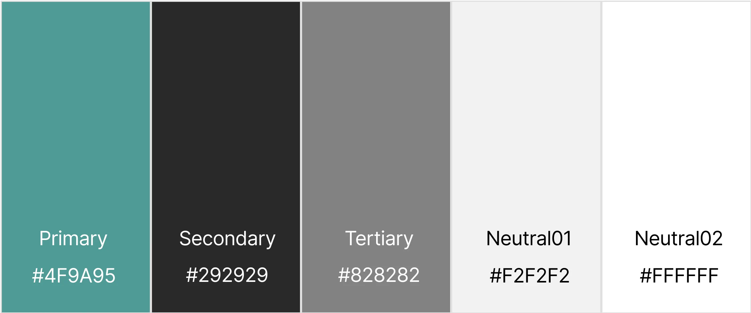
Colour Scheme
We decided on a colour scheme for our creative student mobile app platform that includes a primary accent colour and several neutral colours. The accent colour, #4F9A95, was chosen to draw attention to key areas of the app, such as the students' feed and creative works. The neutral colours, including #292929, #828282, #F2F2F2, and #FFFFFF, were chosen to provide a clean and modern aesthetic while also allowing the accent colour to stand out. By using a limited colour palette, we aimed to create a cohesive and consistent user experience throughout the app. Overall, this colour scheme was chosen to emphasize the importance of the students' creative works and provide a visually appealing and user-friendly platform for their expression..
Initial Wireframing
During one of our online meetings, we discussed and created a list with five main screens that each of us had to sketch. A week later, we presented and discussed them. There were screens like Notifications, User profile and Settings that we all designed in the same direction. However, we had differences in the newsfeed and marketplace screens. Additionally, the biggest challenge for us was to identify our main sections and find their most appropriate place to put them – side menu or navigation bar.
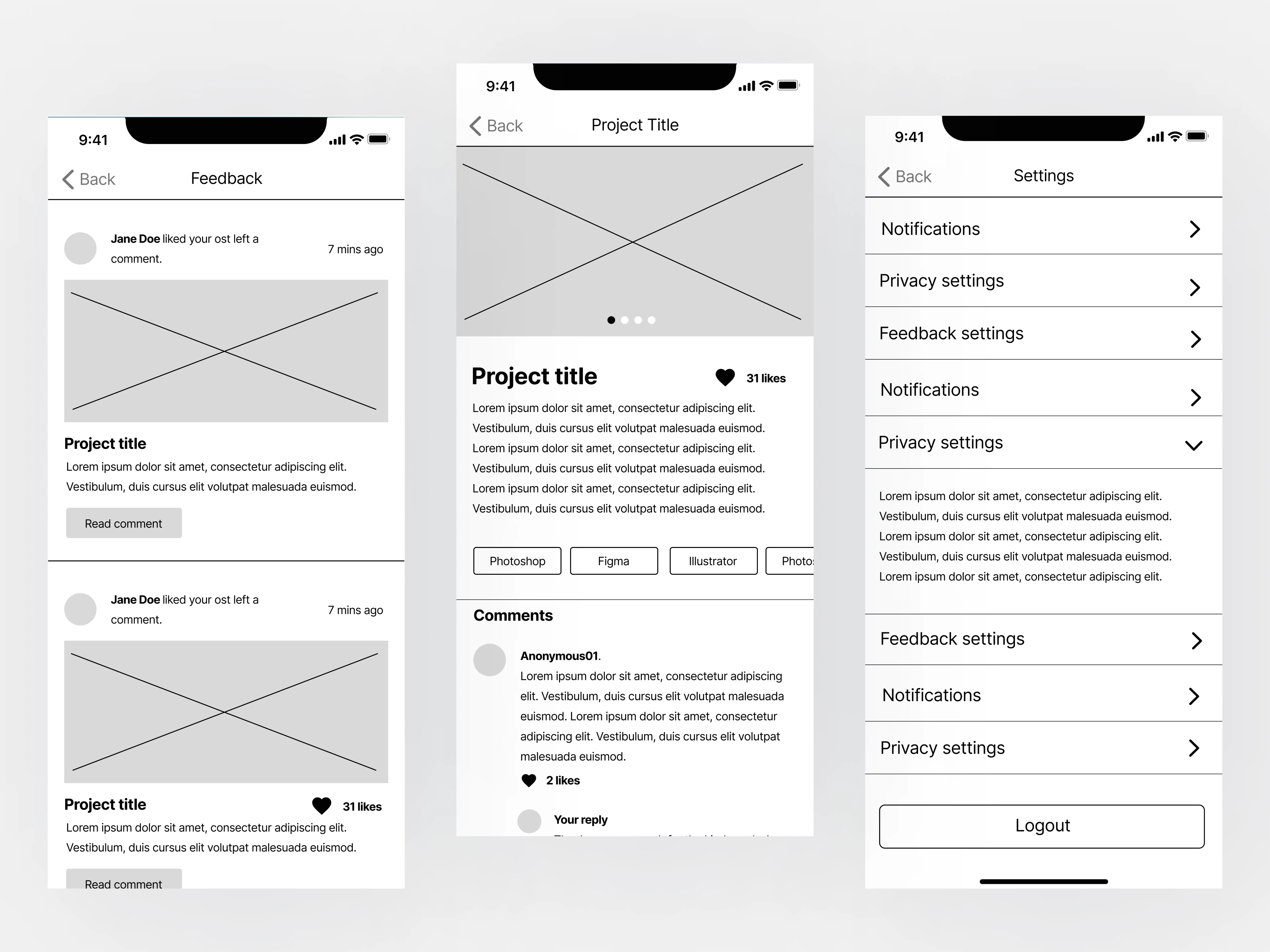
Mid-fidelity Prototype
The mid-fidelity wireframes were created by me. There were two discussions during our practical and online meeting when I presented them and received feedback. I refined some of the sections and created other needed ones. Catherine took the initiative to create the requesting service feature, which we also discussed together and refined. Overall, each member of the team was satisfied with the result and approved that it visualised everyone’s vision of the platform.
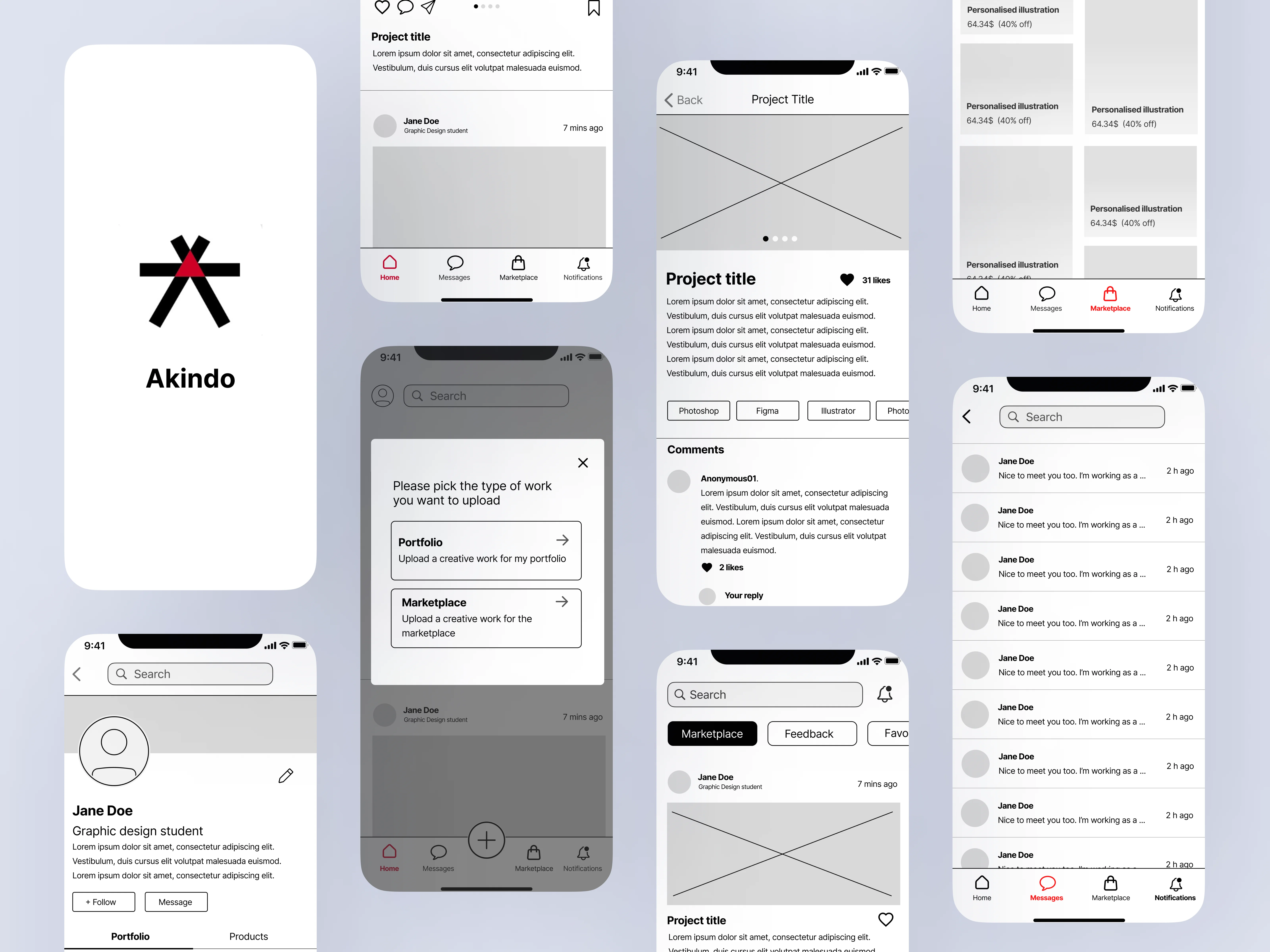
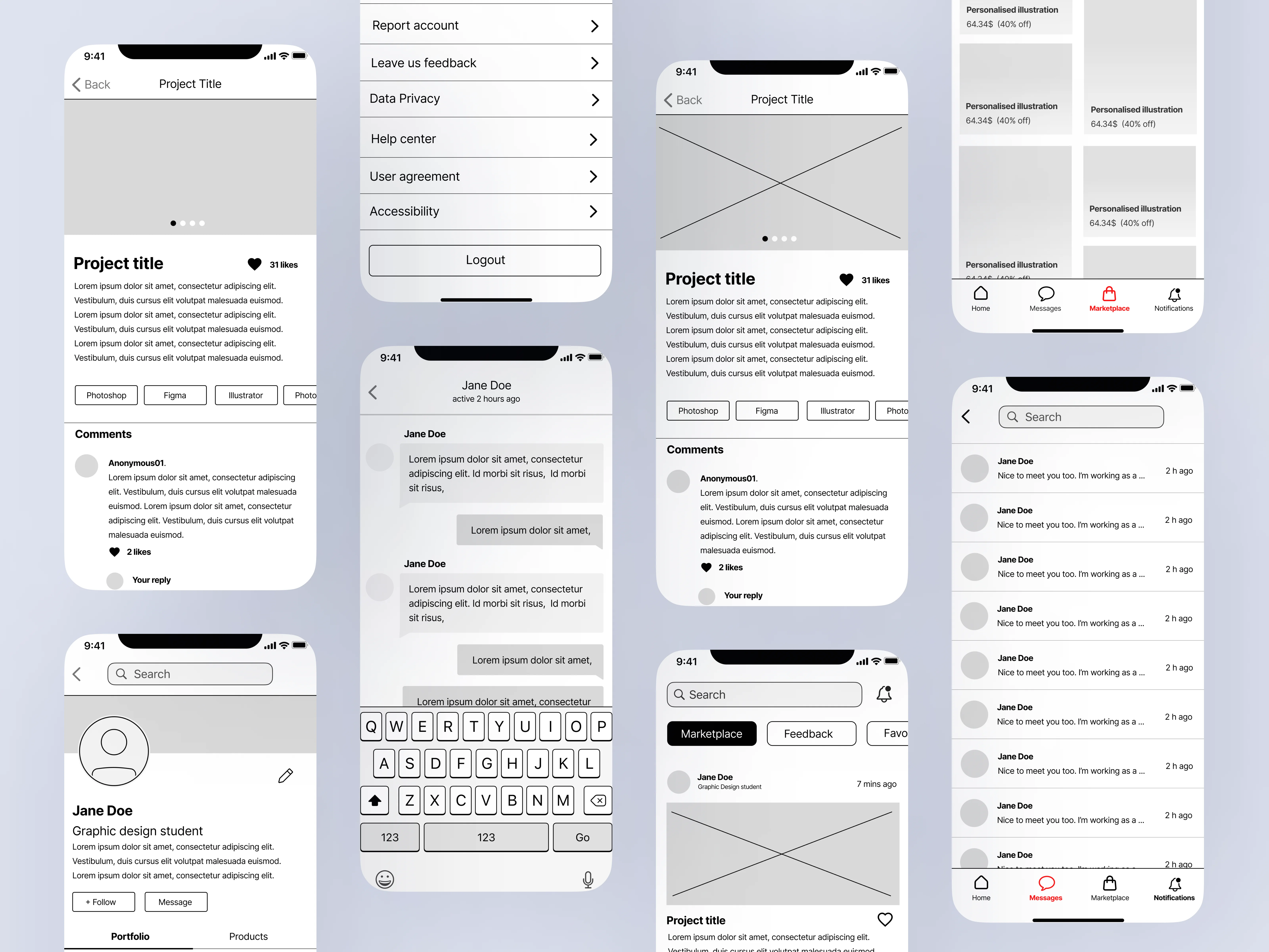
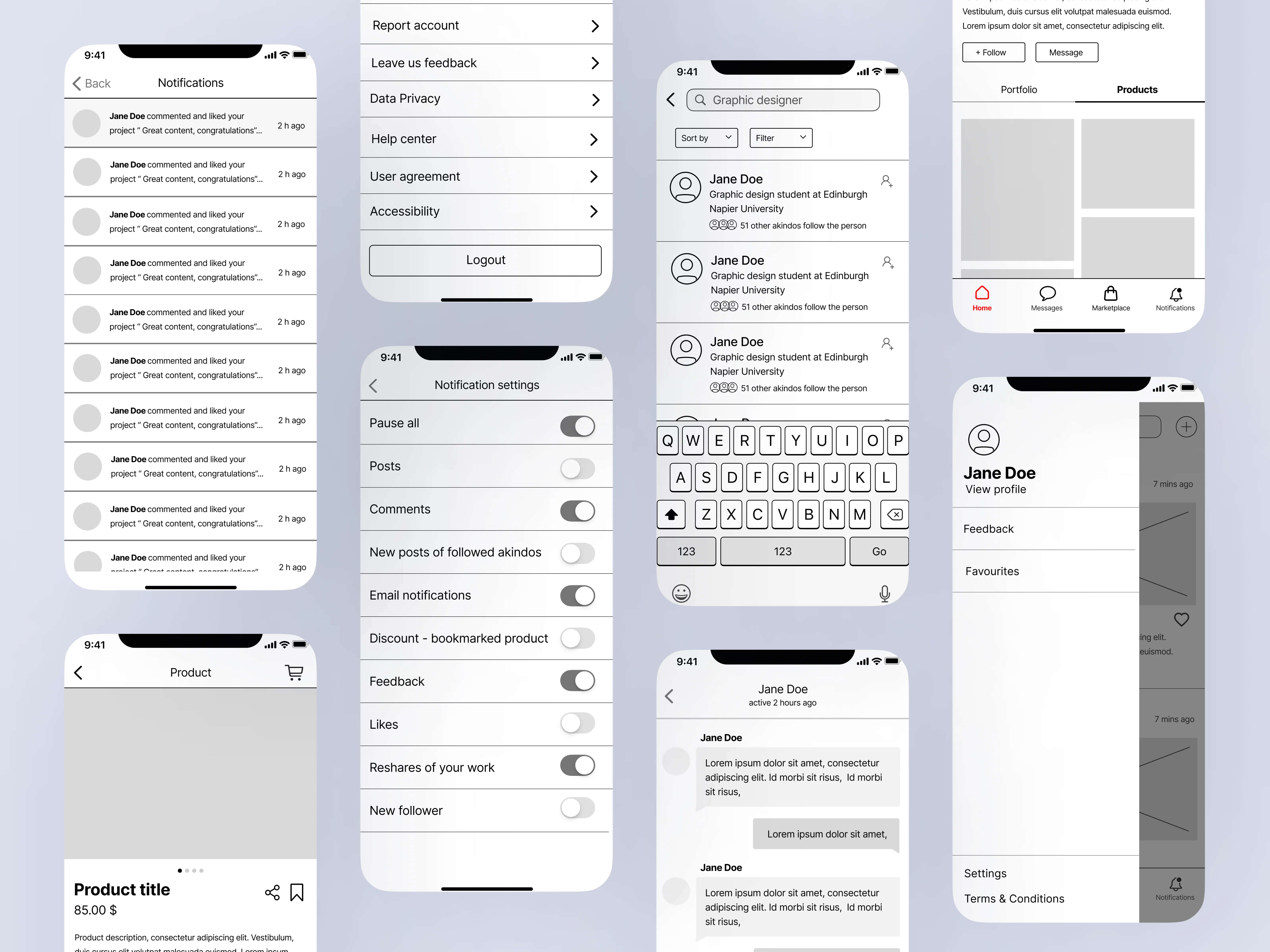
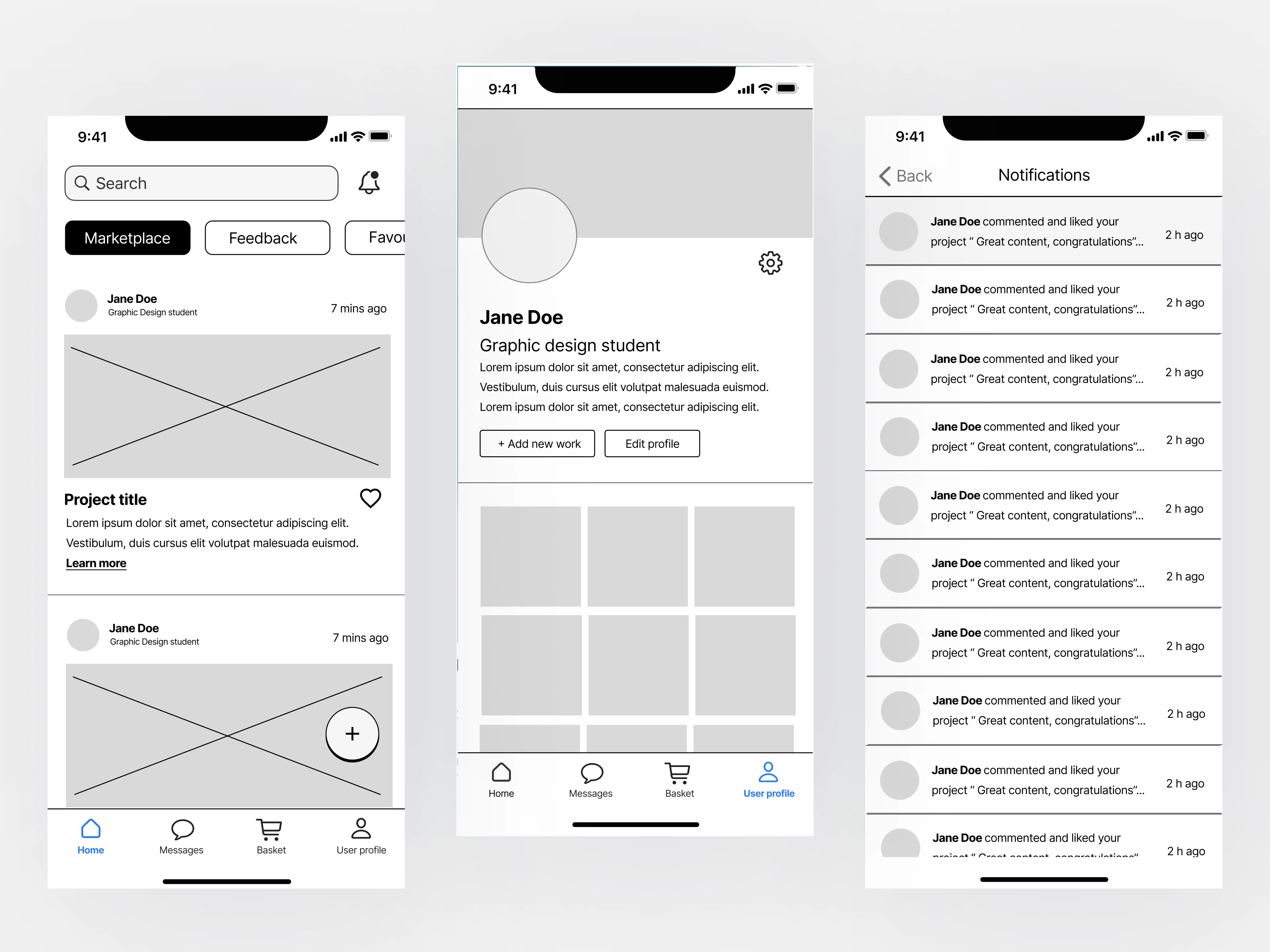
High-fidelity prototype
The high-fidelity prototype presents all sections of the app. By building a high-fidelity prototype, designers can identify potential usability issues and make necessary adjustments before the final product is launched. This process helps to reduce costs and increase customer satisfaction, ultimately leading to a successful product launch.
Interactive Prototype
Key lessons
-
Structuring, refining, and analysing data on research methods takes time that need to be considered
-
Always ask for consent and do piloting step in all research methods
-
Alwyays do specific research on the target audience and look through the existing literature
-
Always do technical audits before interviews and practice appropriate interview behaviour
Conclusion
It was a pleasure to work with such creative
and hard-working individuals. Each of us contributed by giving ideas,
researching, and presenting insights that made the overall process
smooth and consistent. One of the things that I believe helped us
deliver broad research was that we are all from different countries
(Scotland, Italy, Bulgaria, Slovakia, and China), which gave us access
to more information and system examples. I enjoyed our online meetings,
where we critically reflected on each other’s work, which helped us
learn and grow.We used our personal strengths like creativity,
organisation, research, and communication to contribute to the project
deliverables and took equal responsibility for the research methods.
I enhanced crucial soft and
hard like teamwork, organisation, time management and research. What I
could do better was to practice my leadership skills and straight
communication. I acknowledged that with good
organisation and a hard-working team result in delivering the project
objectives on time. The research experience showed me the most promising
path
to creating a user-centred design, which is to design with people, not
for people by conducting research.
Other Creative Works
Please feel free to explore other projects I have worked on