EcoSim: An Eco-friendly Gamified App - UX/UI Case Study
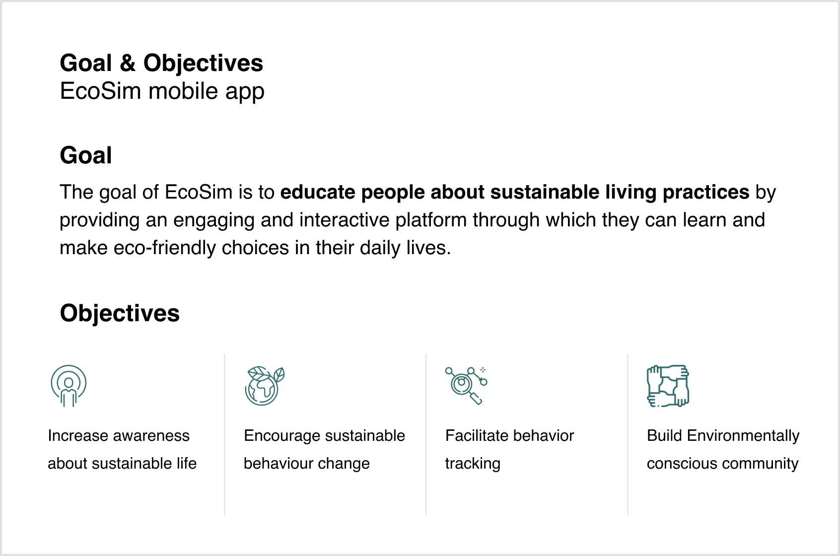
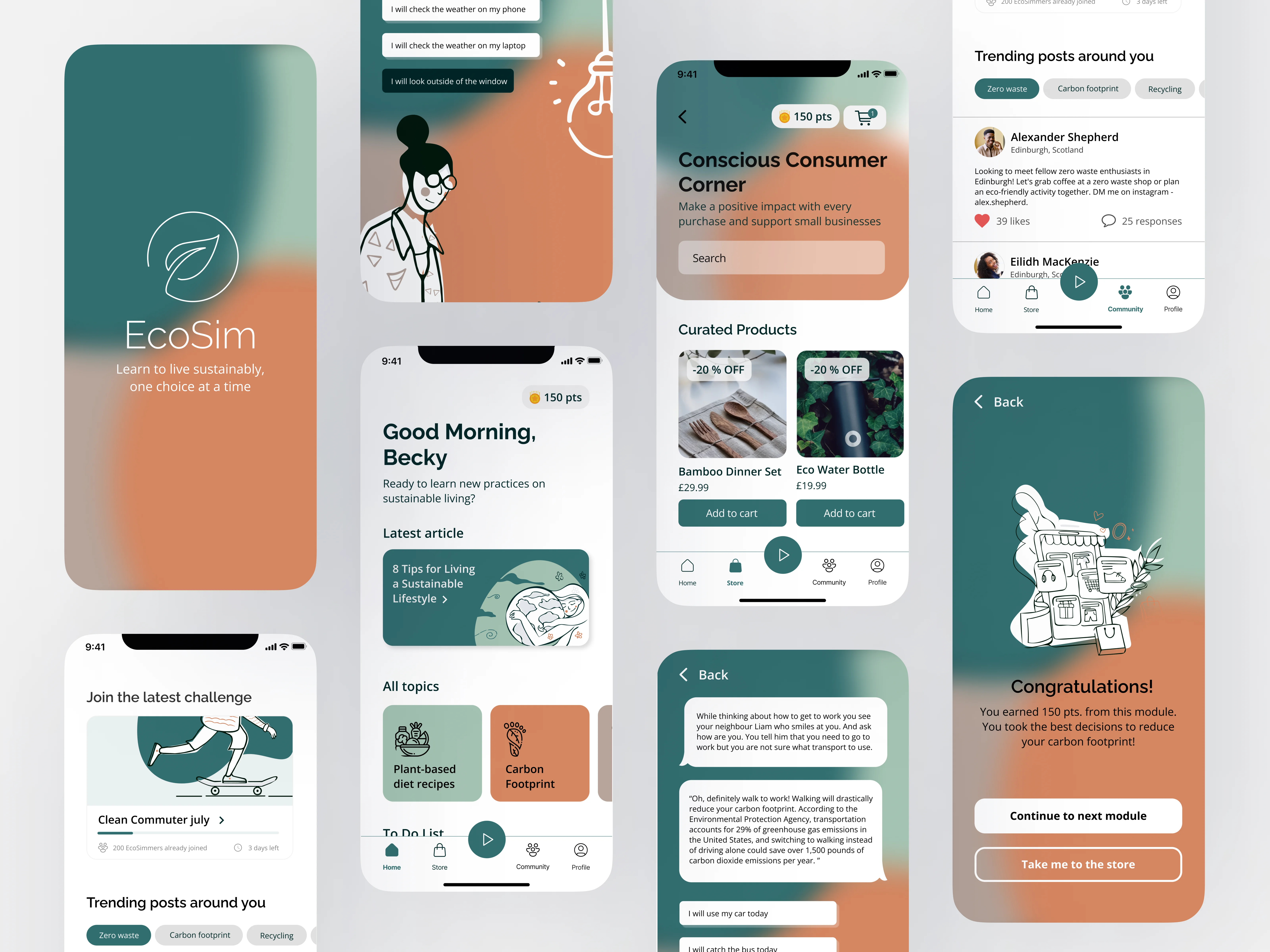
EcoSim is a gamified app that teaches people to live more sustainably through life simulations. The game puts the player in everyday situations and makes them choose which activity is best for the environment. The more sustainable choices the user takes, the more points the player gets. The earned coins are exchanged for discount vouchers on sustainable products.
Project Details
Industry: Sustainability
Project duration: 2 weeks
Deliverables: UX research, Analysis User journey, Persona, Mobile app design
Team: Iliyana Pirinska
My role
-
UX/UI Research
-
Visual identity
-
Wireframing
-
Prototyping
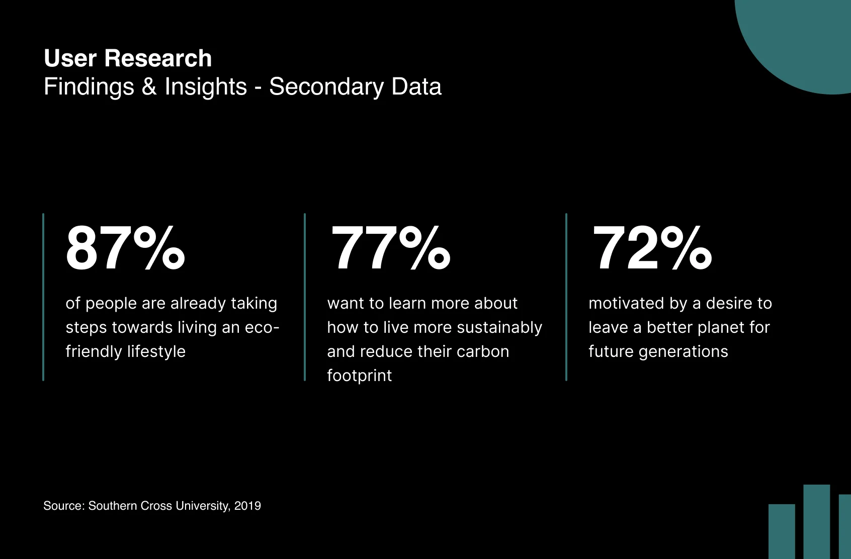
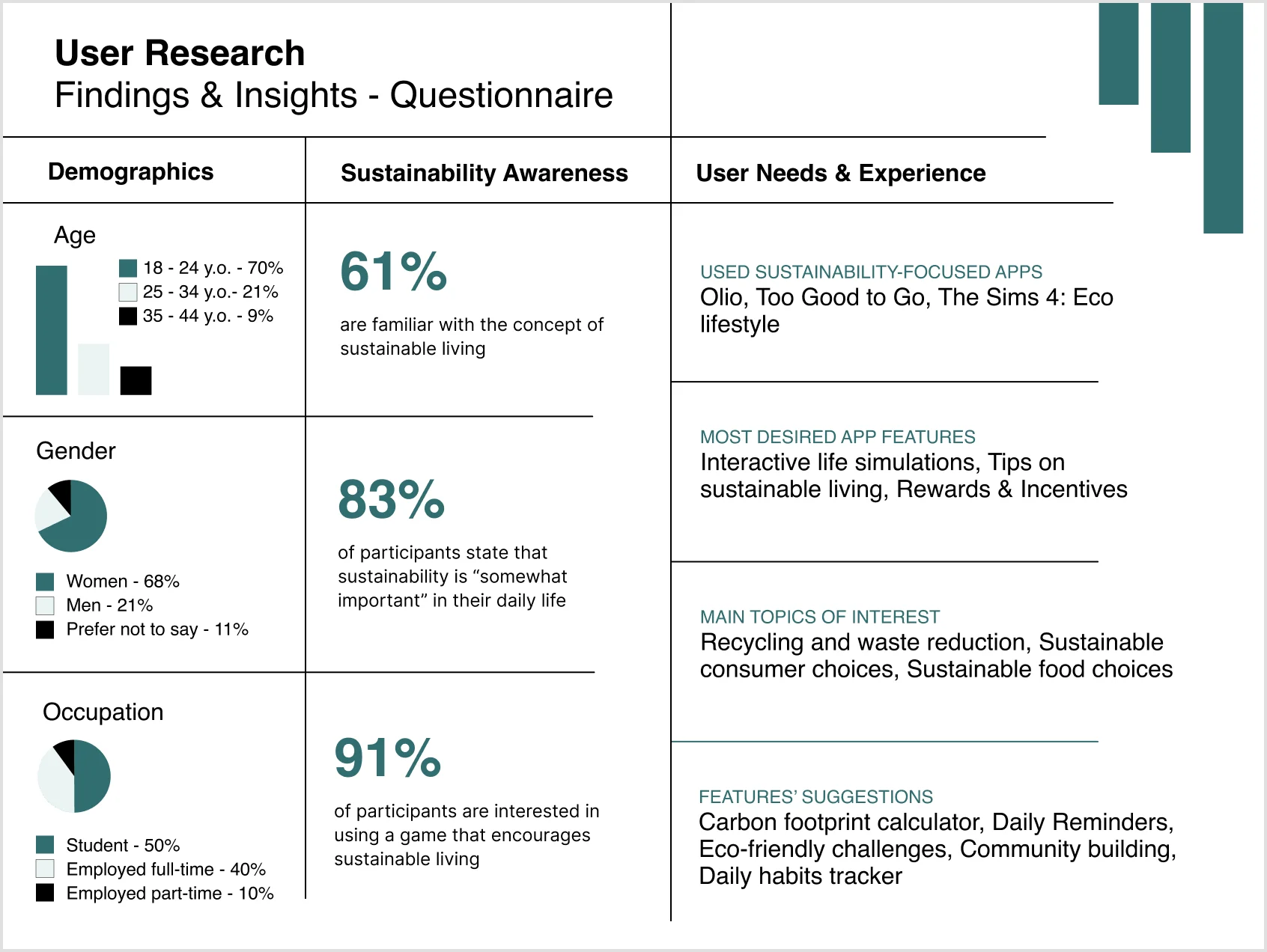
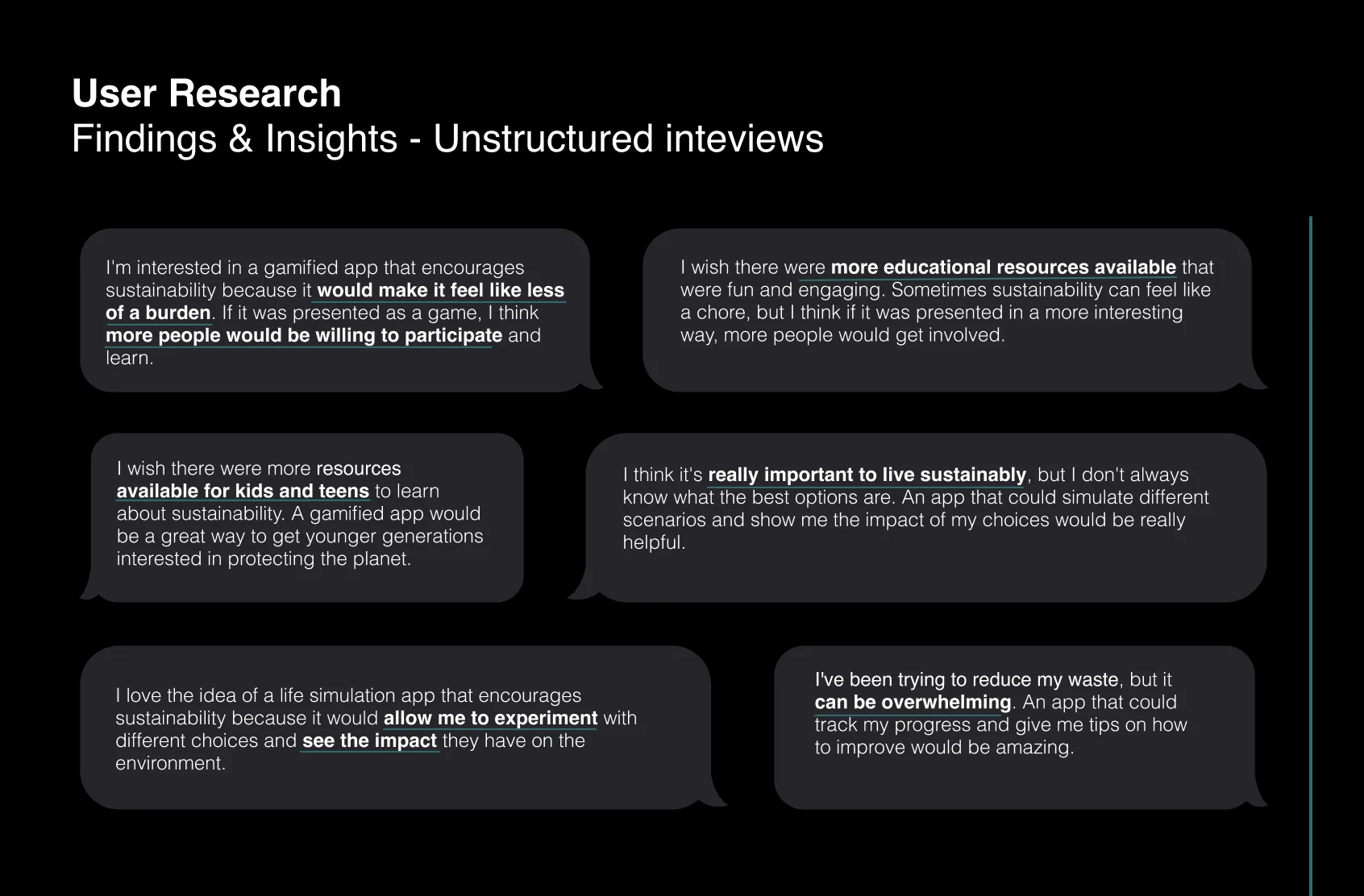
User Research
Problem Definition
Through secondary data research, unstructured interviews, and a questionnaire, the problem statements for a gamified app that encourages sustainability have been identified.
-
Many people are not aware of the negative impact of their daily transportation choices on the environment, and are unsure how to make more sustainable choices.
-
Waste management and recycling can be confusing and overwhelming, leading individuals to dispose of materials improperly and contribute to environmental pollution.
-
Despite interest in reducing energy consumption and increasing the use of renewable energy sources, individuals lack the knowledge and tools to make informed decisions about their energy usage.
-
The use of single-use plastics and other unsustainable materials in daily life is widespread, but individuals often do not realize the extent of their impact on the environment.
-
Food waste is a major contributor to environmental degradation, but individuals may not be aware of how to reduce their waste or the impact it has on the planet.
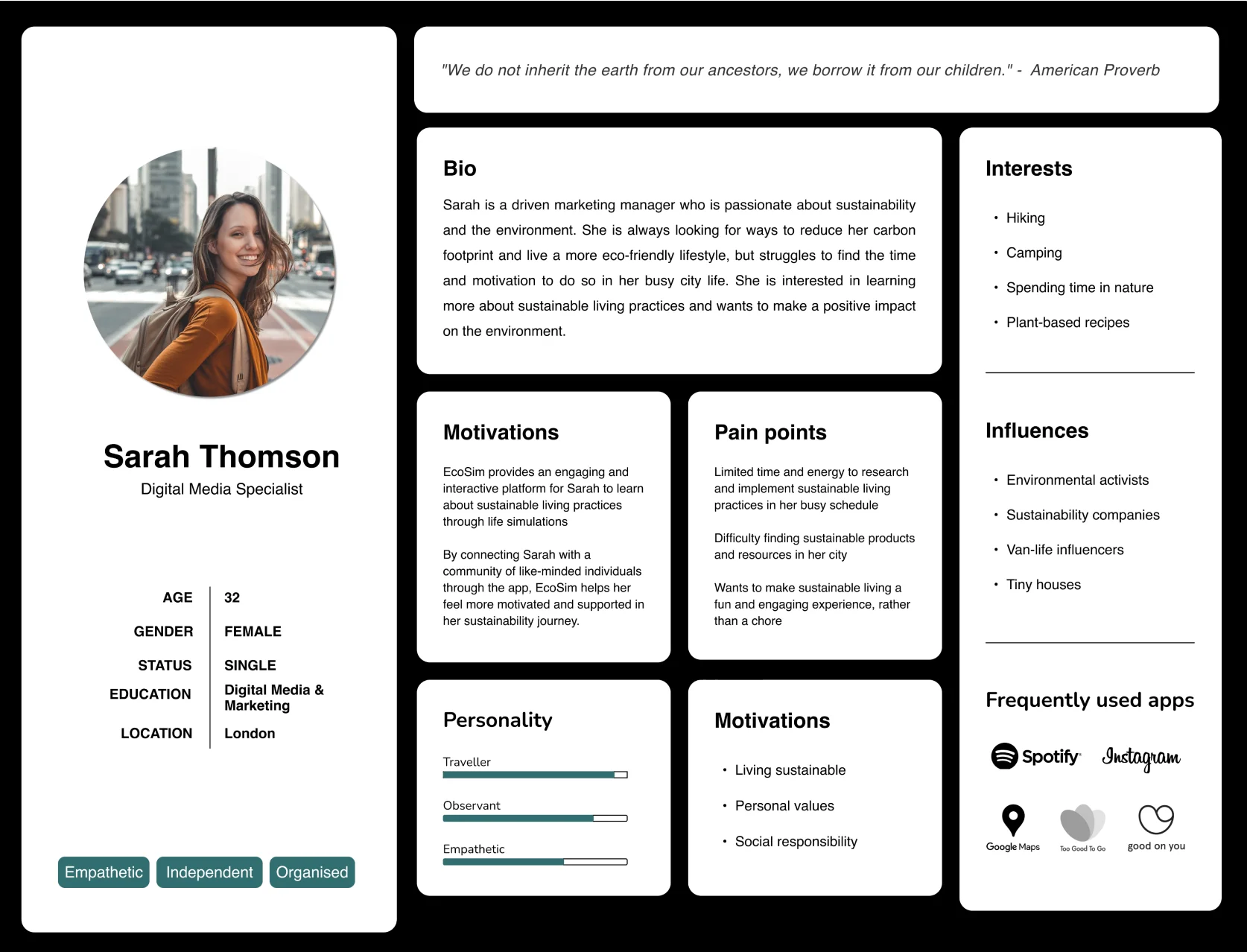
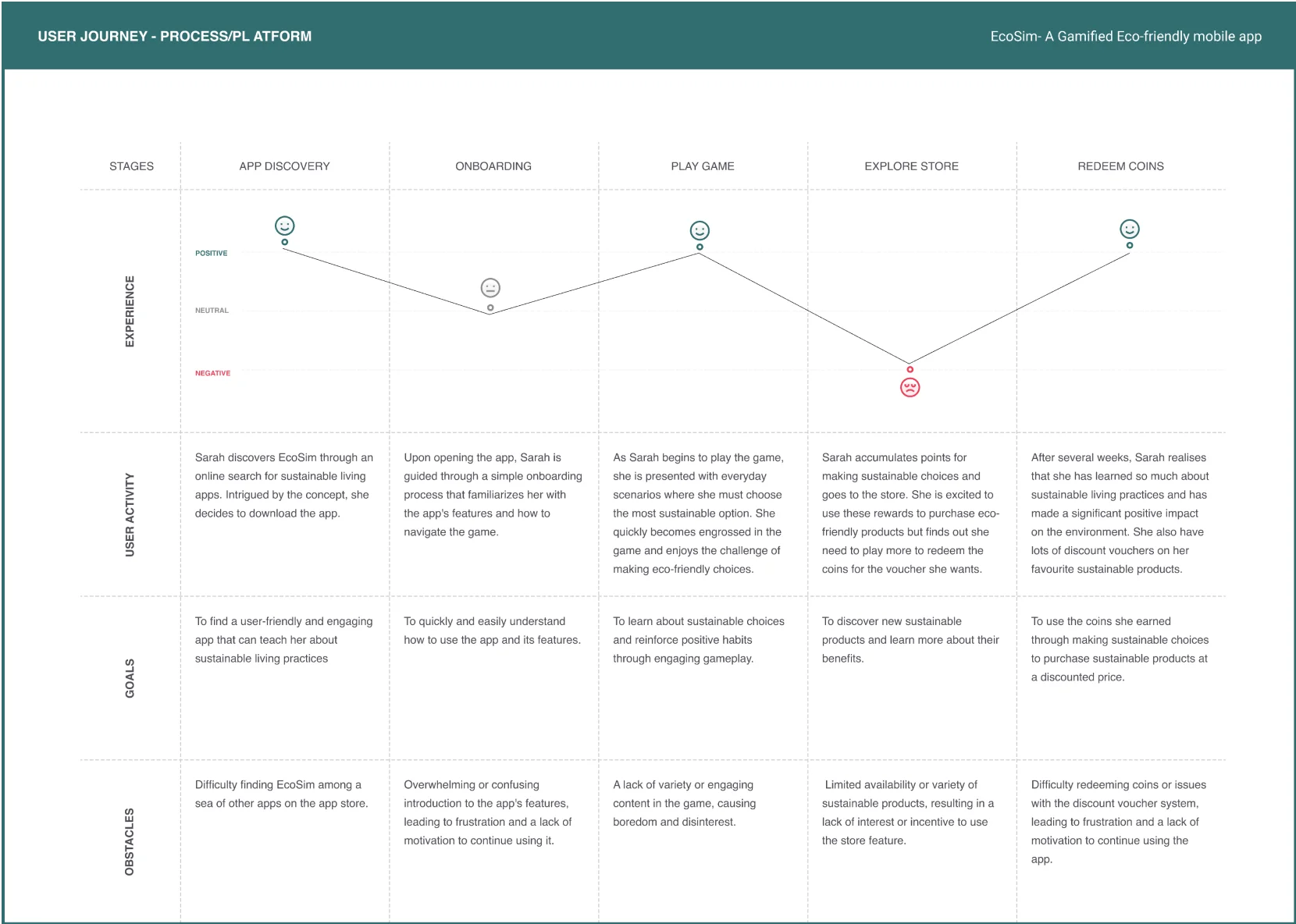
Building Empathy
The user journey and persona were developed based on the combination of secondary data research, questionnaires, and interviews. We conducted thorough research on the target audience's needs, preferences, and behaviours by analyzing existing data on sustainable living habits.
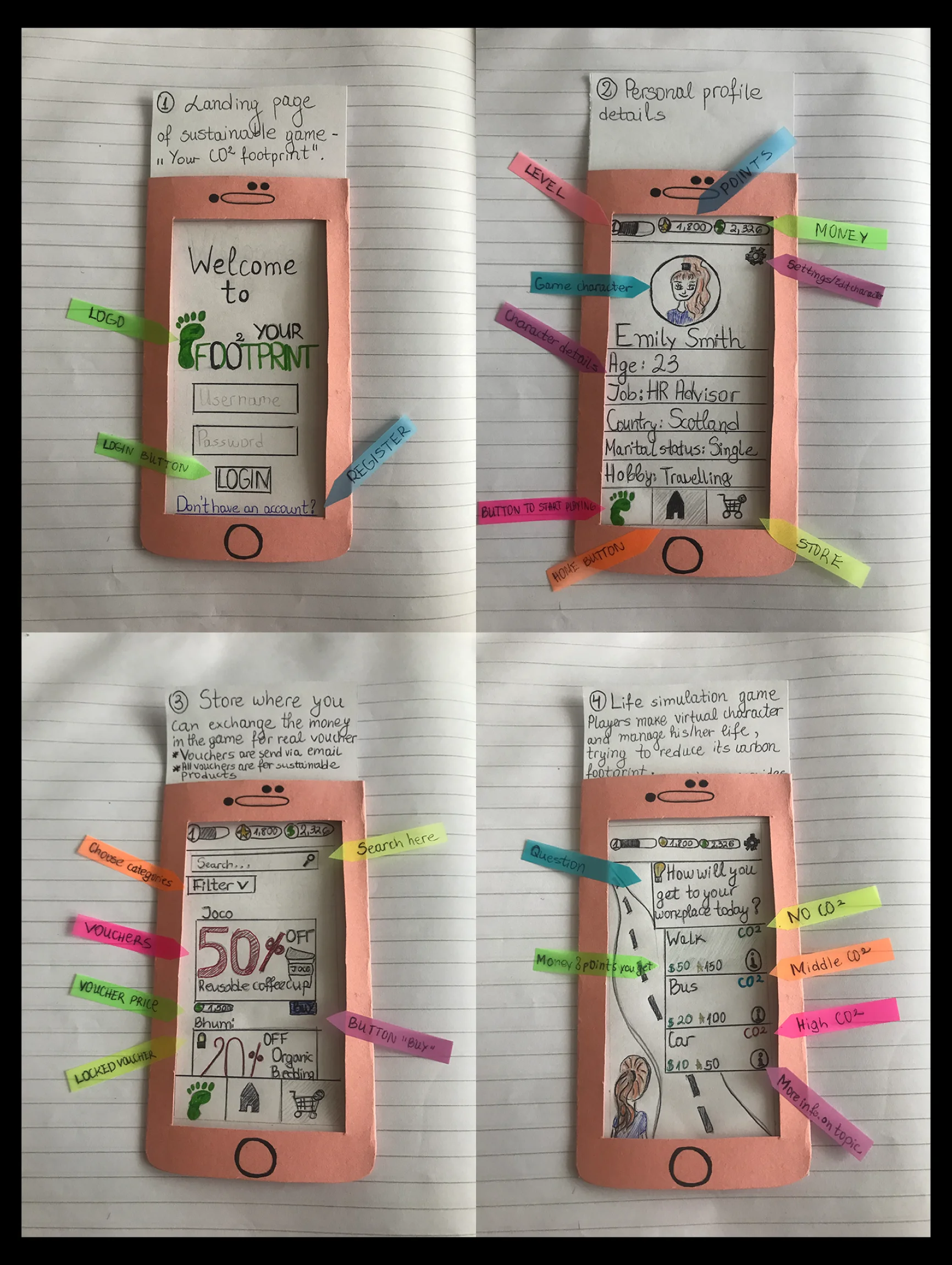
Paper Prototype
Paper prototypes offer several benefits for designers and developers.
-
Quick and easy to create, allowing for rapid iteration and refinement of ideas.
-
They are low-cost, making them an accessible option for teams with limited resources.
-
They encourage collaboration and feedback from team members and potential users.
-
They help identify design flaws and usability issues early in the development process.
Important note: The initial game app name was “Your Carbon Footprint” but after thorough visual identity research, the name was changed to “EcoSim” as well as the logo.
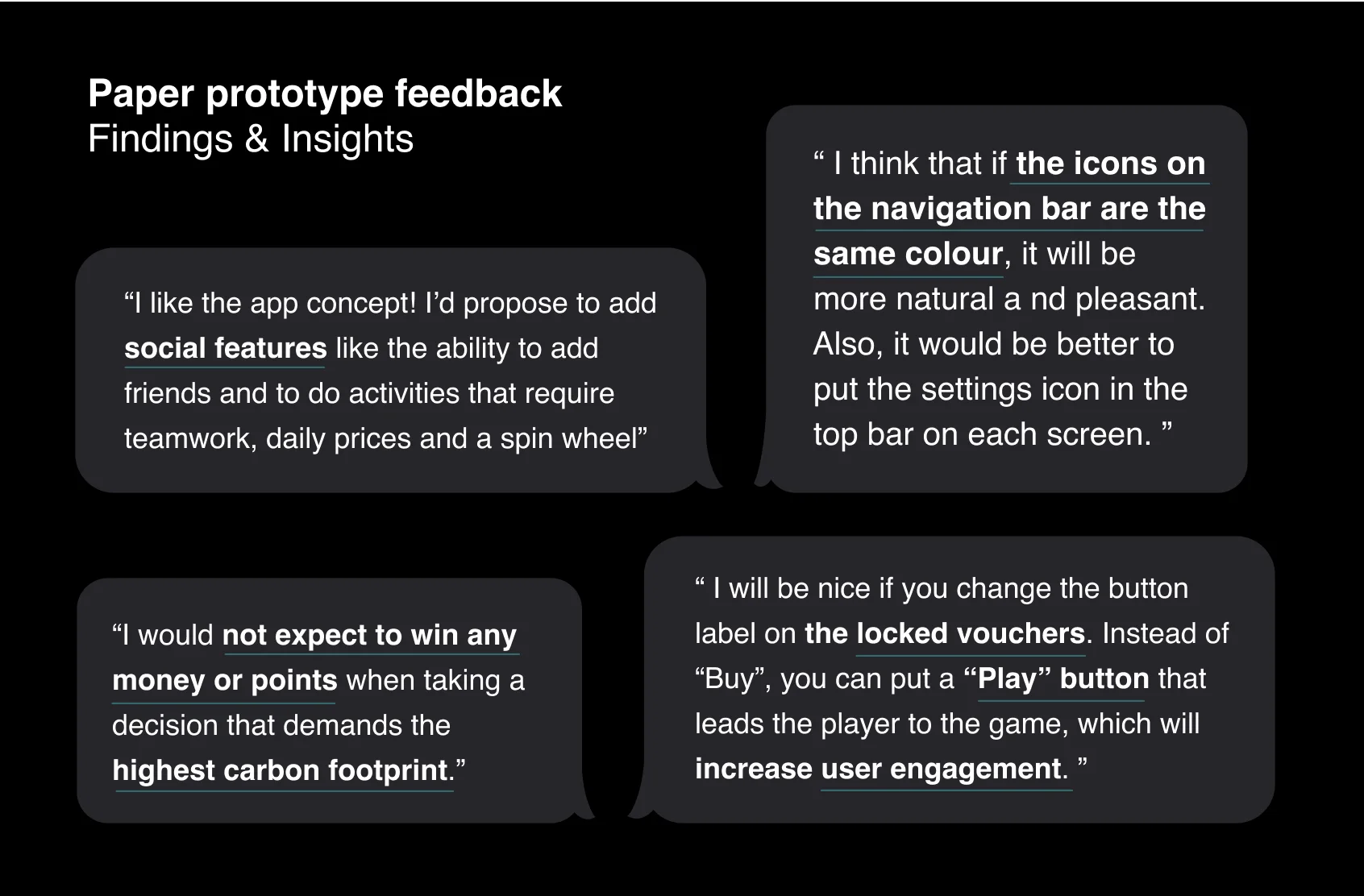
Feedback of paper prototype
The feedback made me notice some UX/UI issues that were consequently reflected on the high-fidelity designs.
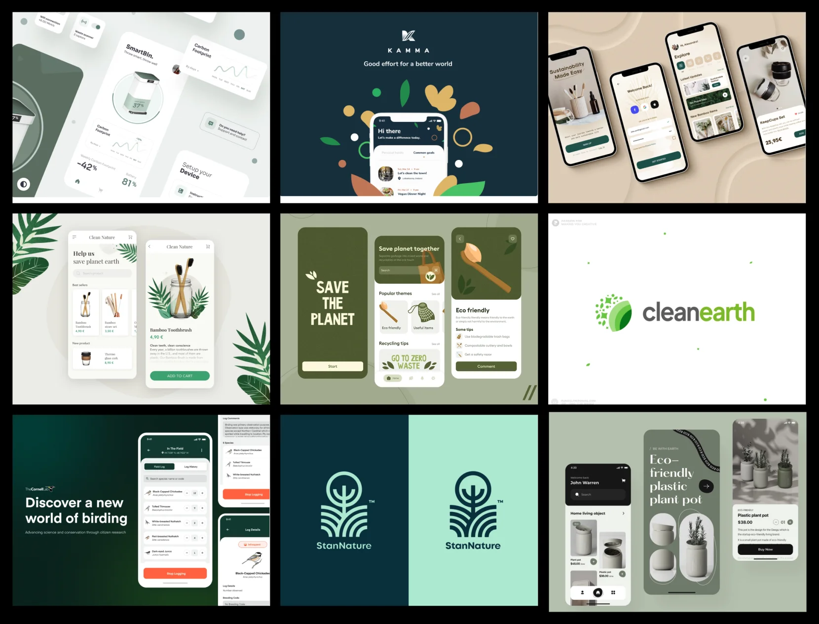
Eco-friendly Mobile Apps - UI Benchmarks
Paper prototypes offer several benefits for designers and developers.
-
Minimalistic Design: The design should be minimalistic and clutter-free, which would make it easier for users to navigate through the app and focus on the content.
-
Eco-Friendly Color Scheme: The color scheme should be environmentally friendly and use shades of green, blue, and brown, reflecting the natural world.
-
Use of Natural Imagery: The use of natural imagery, such as leaves, trees, and animals, can reinforce the eco-friendly theme of the app.
-
Clear CTA Buttons: The Call-To-Action (CTA) buttons should be easily noticeable and clearly labeled, with action words that convey the purpose of the button.
-
Consistent Design: The design should be consistent throughout the app, with a uniform layout, typography, and color scheme.
-
Use of Negative Space: The use of negative space can improve the app's usability, making it easier for users to navigate through the app.
-
User-Friendly Navigation: The navigation should be user-friendly, with clear labels and easy-to-use icons, making it easy for users to find what they're looking for.
-
Interactive Animations: Interactive animations can improve the app's engagement, making it more fun and interactive.
-
User Feedback:The app should provide feedback to the user about their progress, such as the amount of waste they have reduced or the environmental impact of their choices.
-
Easy-to-Read Typography: The typography should be easy to read, with clear, legible fonts that are large enough to be read on a mobile device.
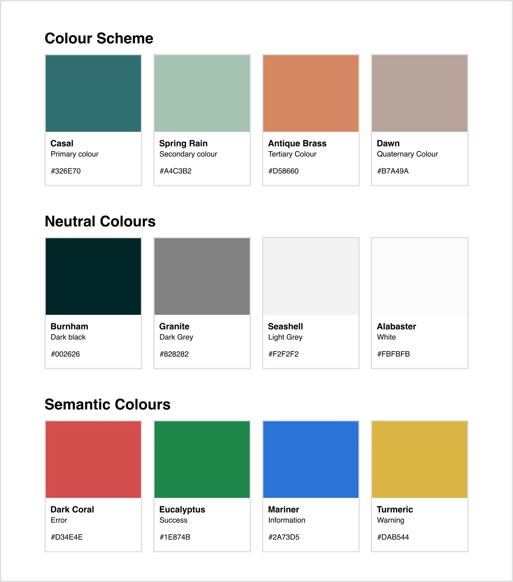
Colour Scheme
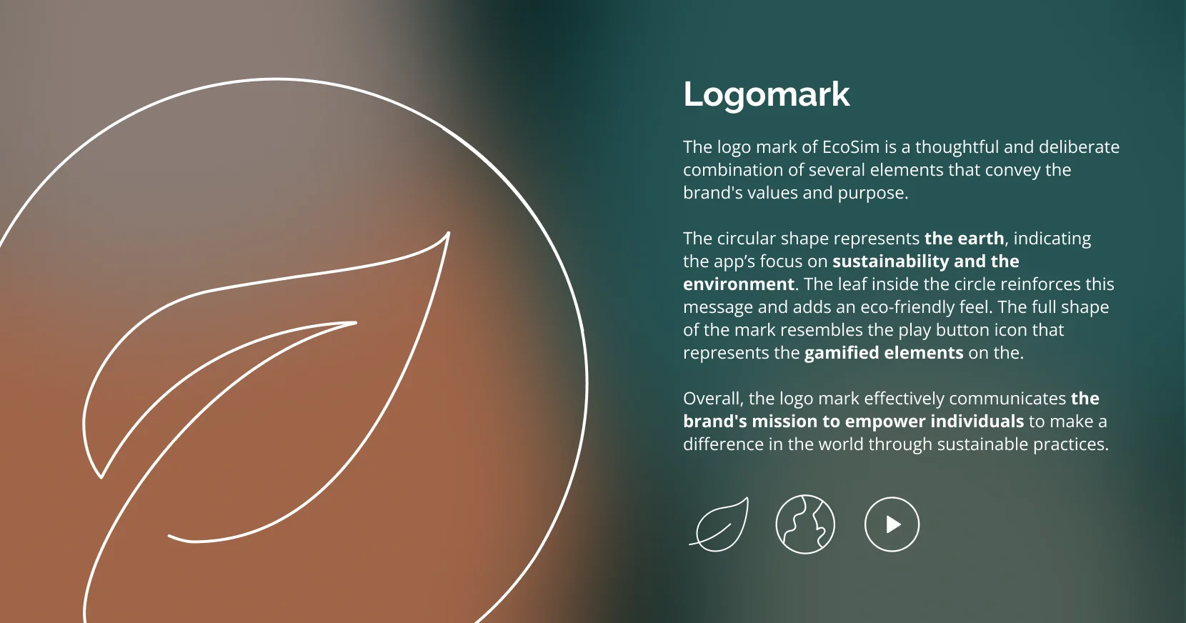
The color scheme incorporates earthy tones and natural textures, representing the eco-friendliness and sustainability-focused nature of the EcoSim app. The primary color is used to create a calming effect, while the secondary and accent colors create a sense of energy and vitality, encouraging users to take action towards sustainable living.
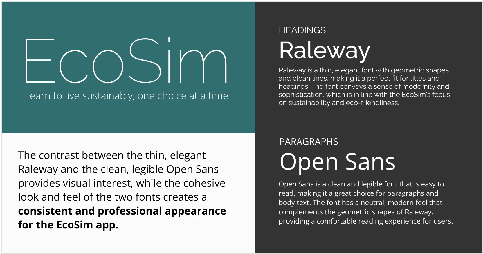
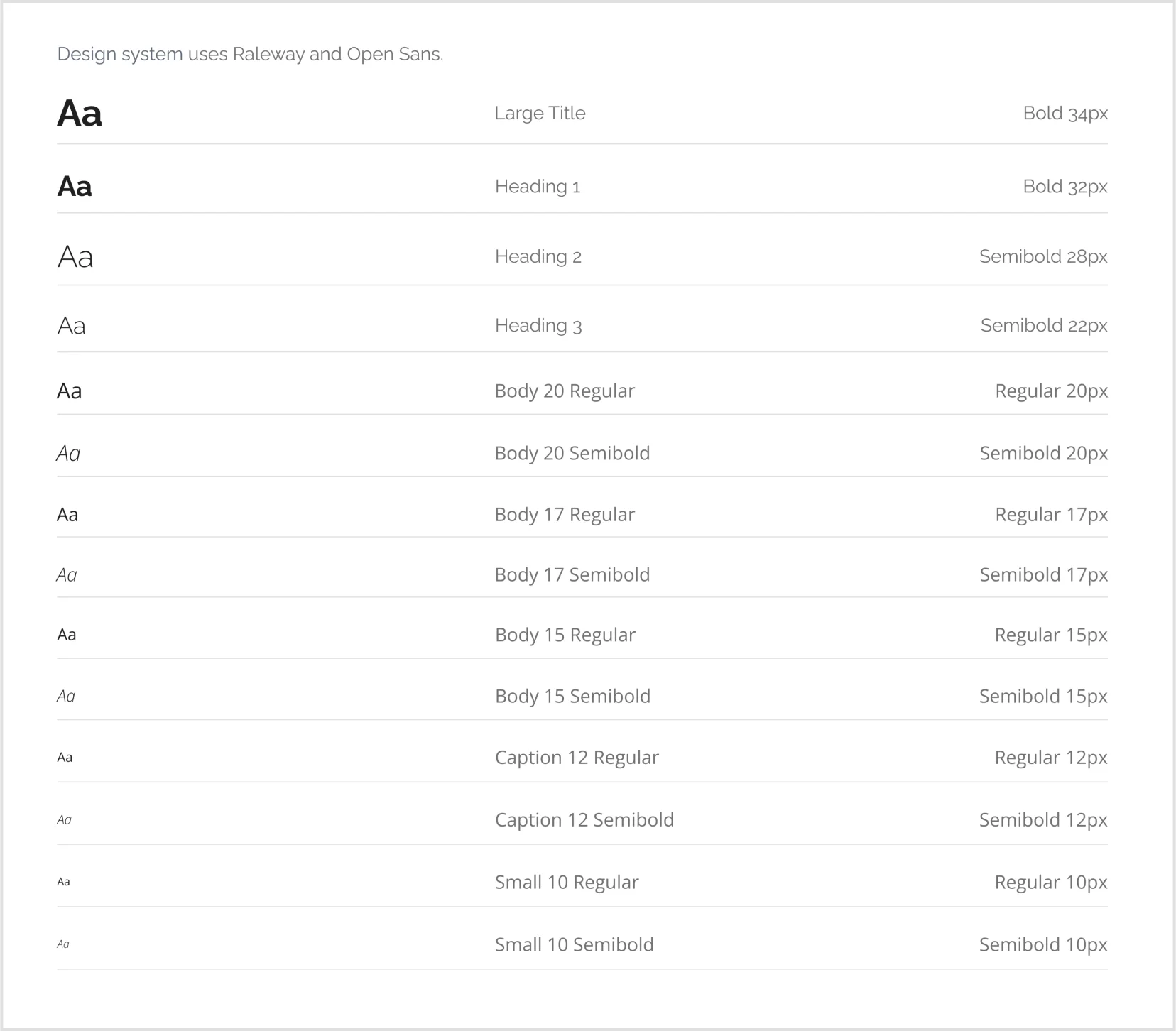
Typography
The color scheme incorporates earthy tones and natural textures, representing the eco-friendliness and sustainability-focused nature of the EcoSim app. The primary color is used to create a calming effect, while the secondary and accent colors create a sense of energy and vitality, encouraging users to take action towards sustainable living.
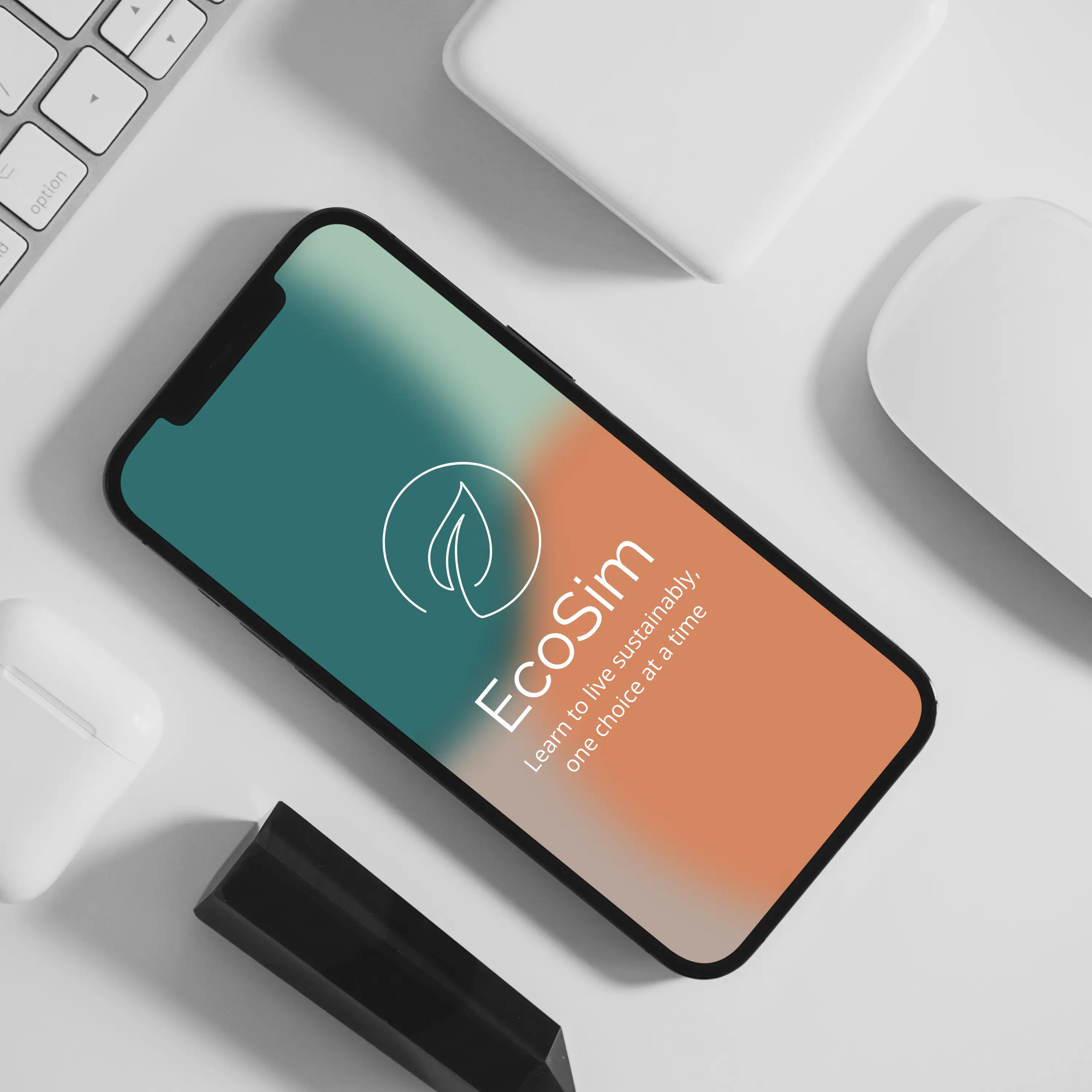
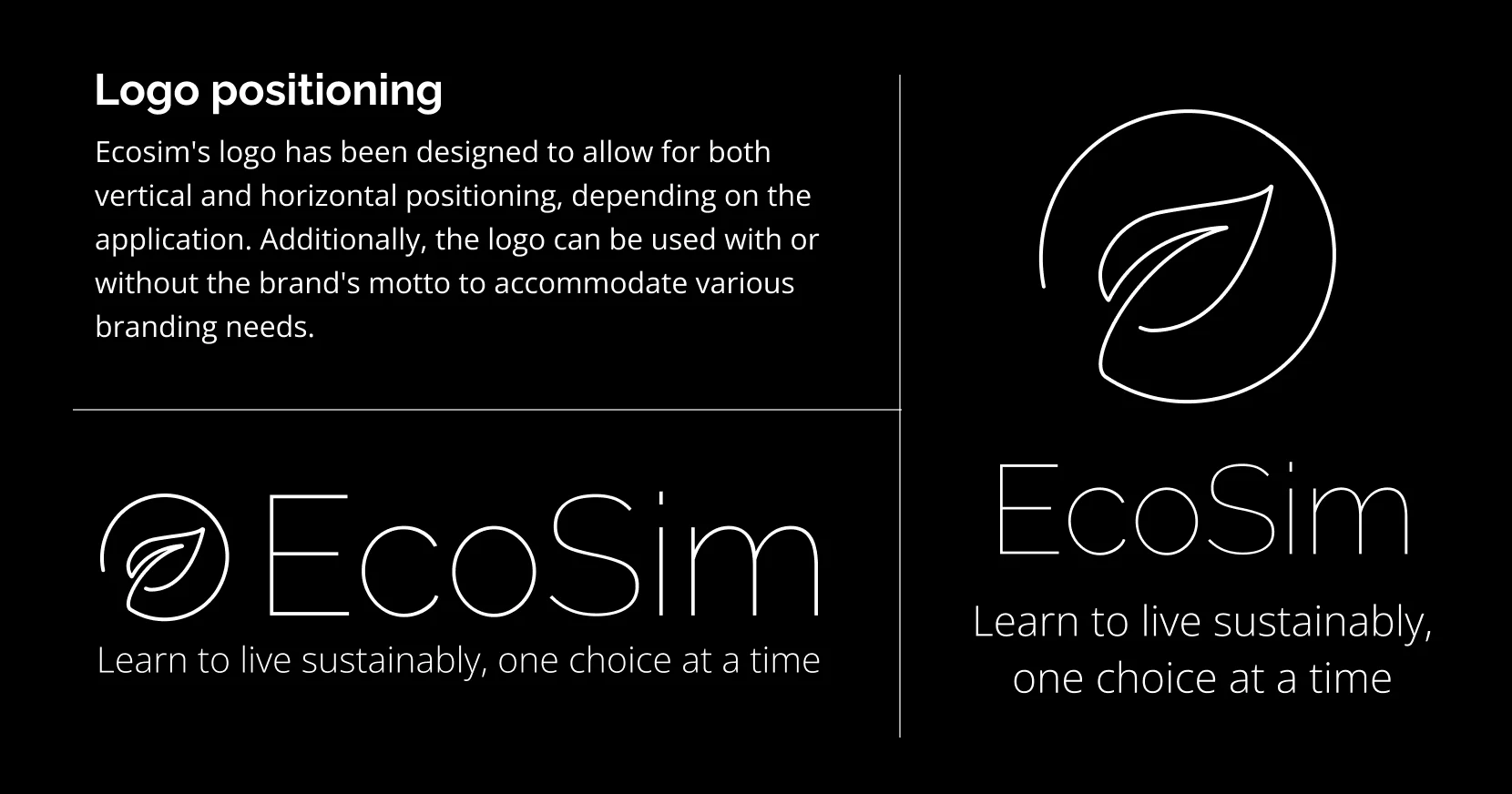
EcoSim Logo
![]()
Mobile app design
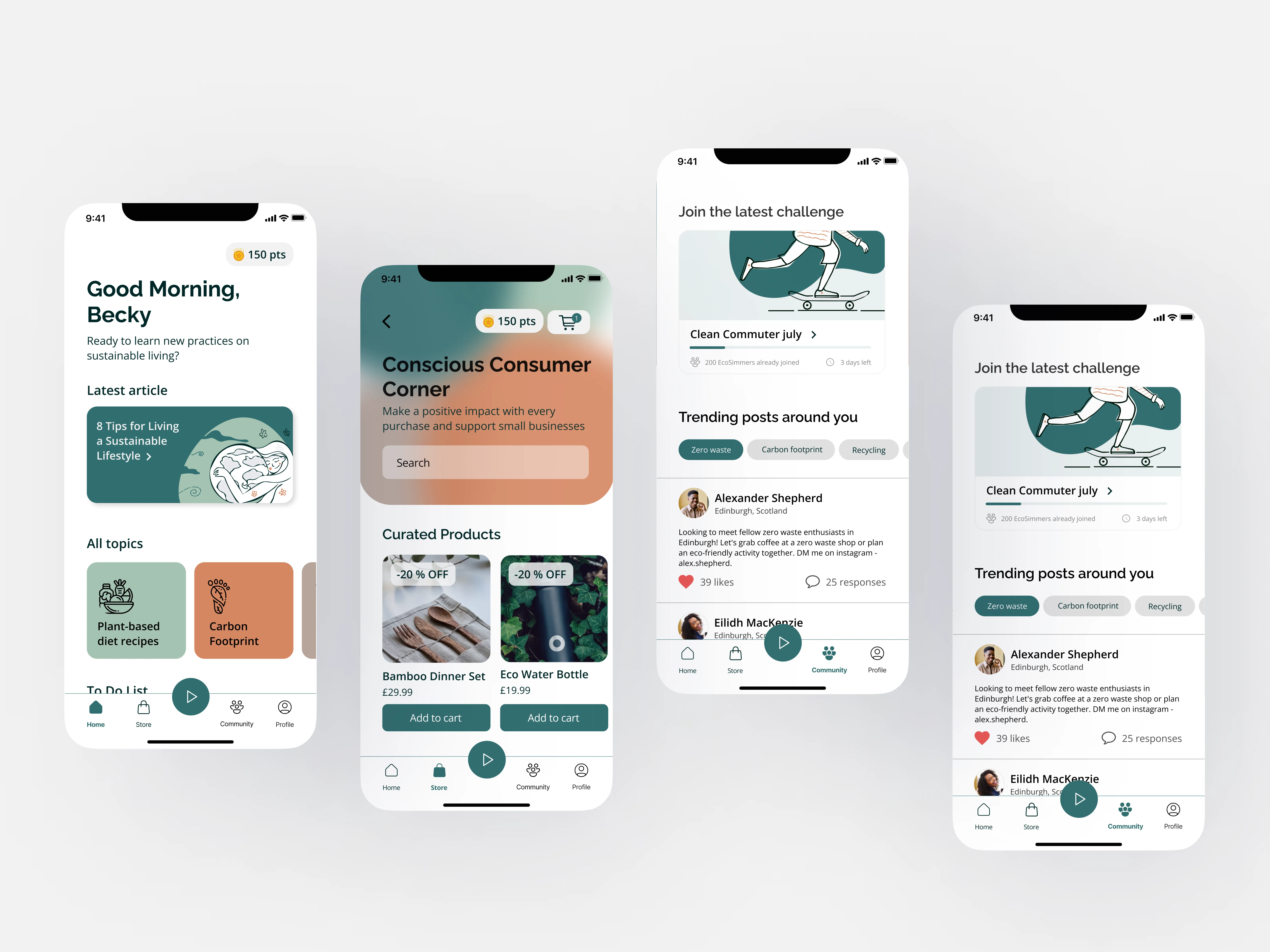
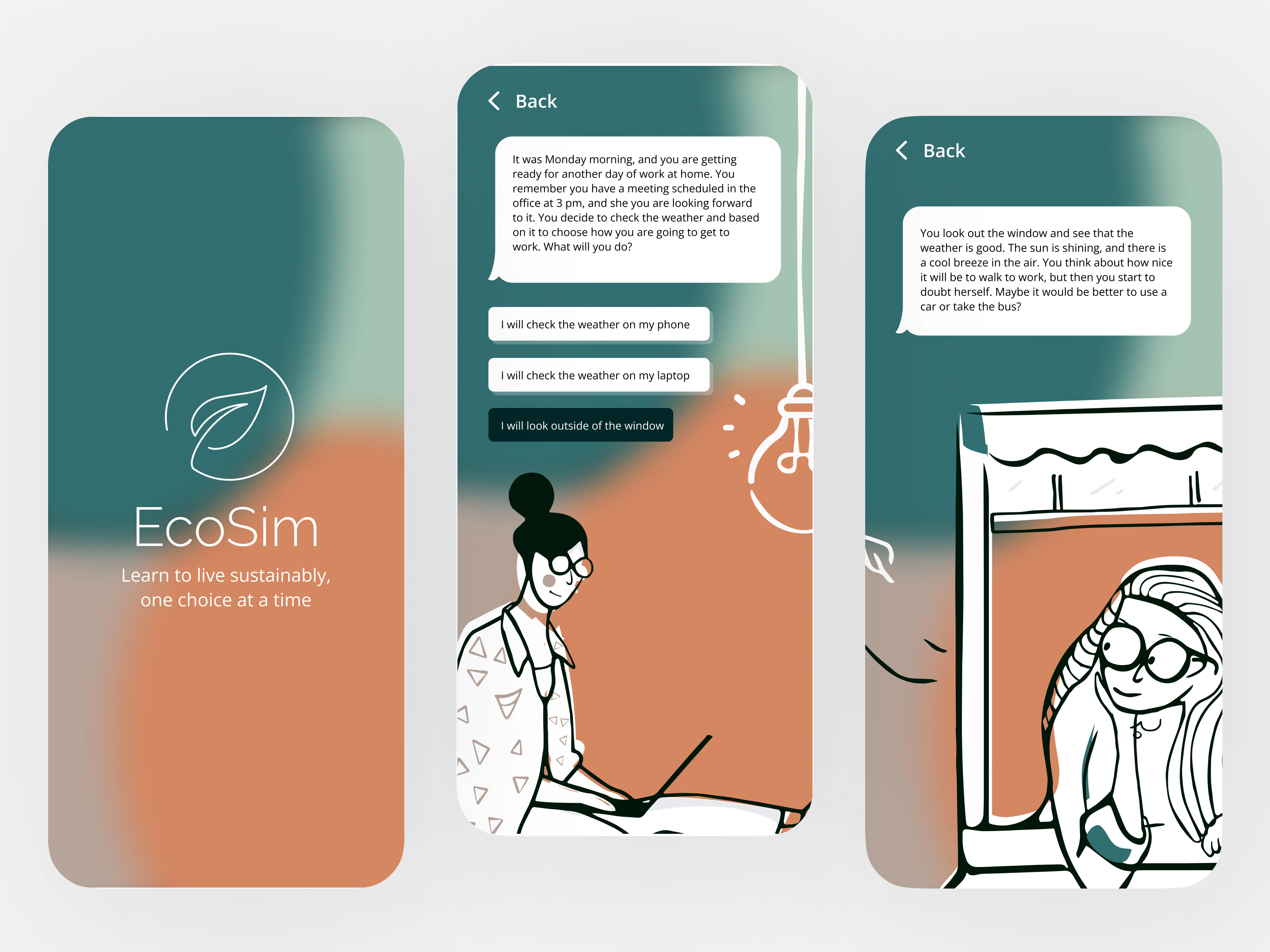
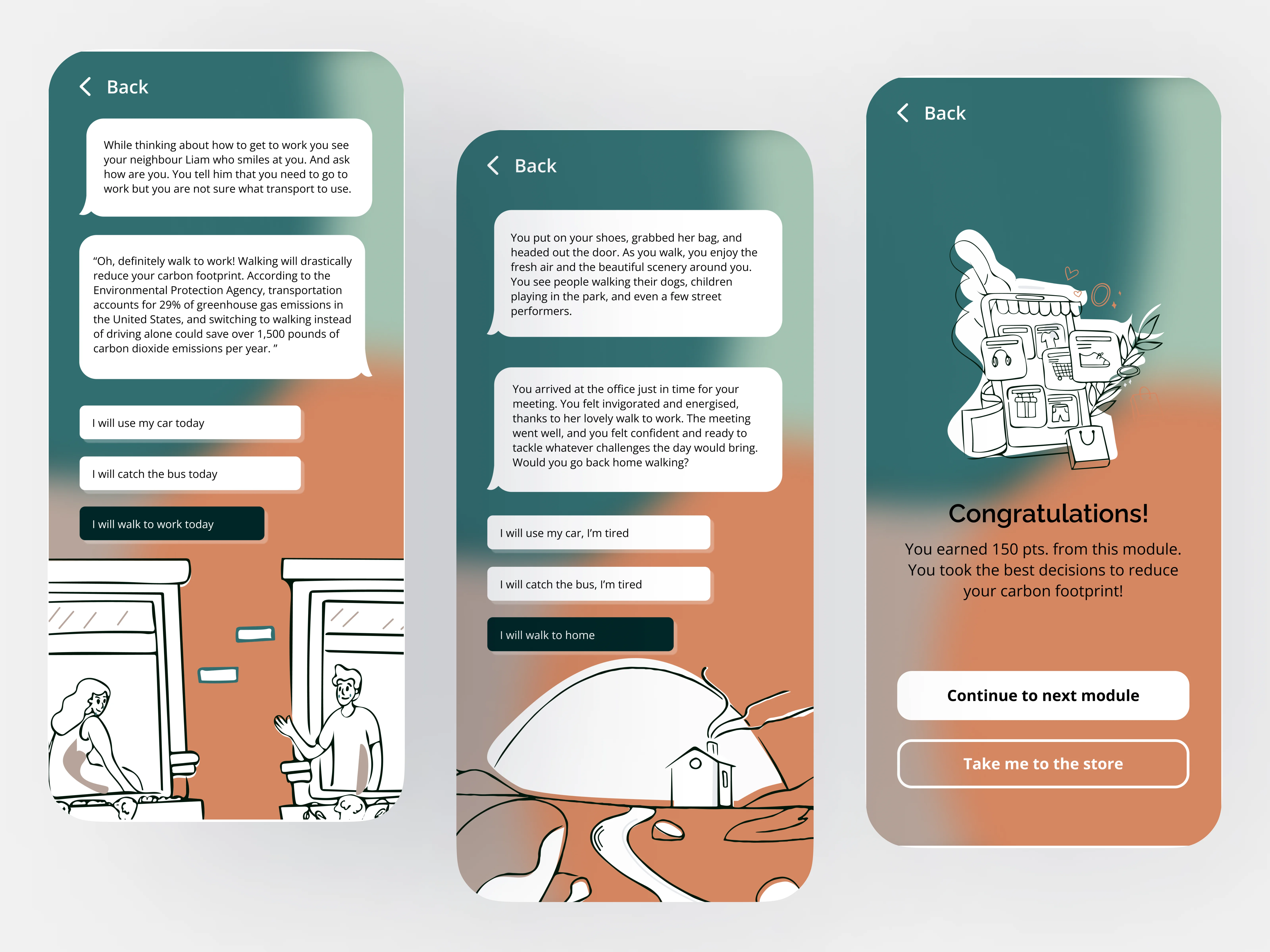
Interactive Prototype
Other Creative Works
Please feel free to explore other projects I have worked on